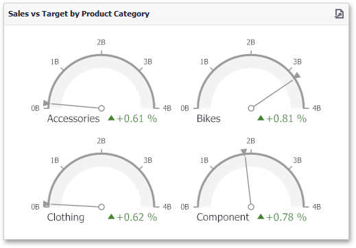
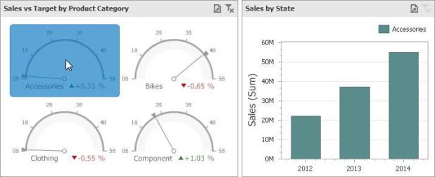
The Gauge dashboard item displays a series of gauges. Each gauge can communicate two values - one with a needle and the other with a marker on the scale.
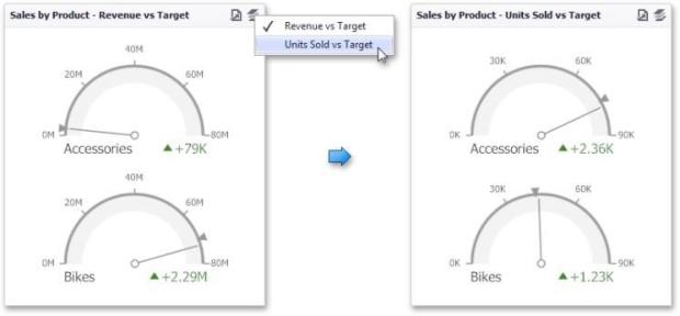
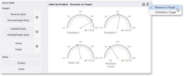
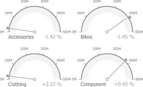
The Gauge dashboard item can illustrate the difference for various sets of values. You can switch between these sets using the Values button (the  icon) in the dashboard item caption or in the context menu.
Providing Data
The Dashboard Designer allows you to bind various dashboard items to data in a virtually uniform manner.
The only difference is in the data sections that the required dashboard item has. This topic describes how to bind a Gauge dashboard item to data in the Designer.
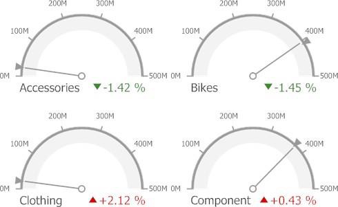
The image below shows a sample Gauge dashboard item that is bound to data.
To bind the Gauge dashboard item to data, drag and drop a data source field to a placeholder contained in one of the available data sections. A table below lists and describes Gauge's data sections.
| Section | Description |
|---|---|
|
Gauges |
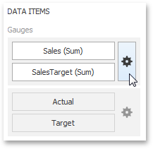
Contains Data Items used to calculate values displayed by gauges. Data Items are arranged in containers. Each data item contain er can hold two Data Items. The first item contains actual data and the second item (optional) contains target data. If both items are provided, gauges show the difference between actual and target values. You can fill several data item containers in the Gauges section and use the Values drop-down menu to switch between the provided values. To invoke the Values menu, click the icon in the dashboard item caption. This drop- own menu is available if the Series section is not empty. Otherwise, a separate gauge is created for each data item container, and all gauges are displayed simultaneously. |
|
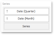
Series |
Contains Data Items whose values are used to label gauges. |
Delta
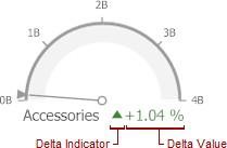
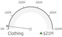
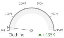
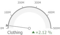
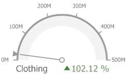
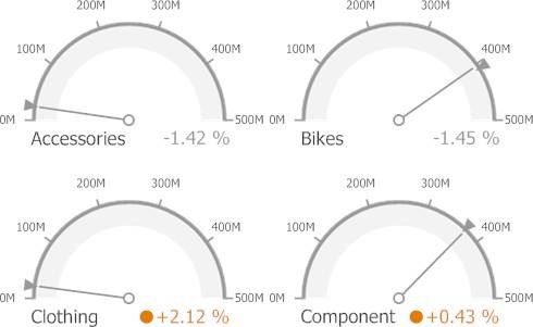
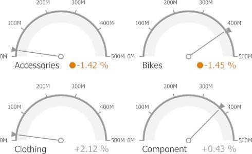
Gauges allow you to display the difference between the actual and target values of a particular parameter. This difference is called delta.
Delta is shown with a delta indicator (indicating whether the actual value is less than or greater than the target value) and delta values (representing this difference as an absolute value or a variation).
To customize settings that relate to the calculation and display of deltas, use the options buttons (the  icon) displayed next to the data item container in the Gauges section of the Data Items pane.
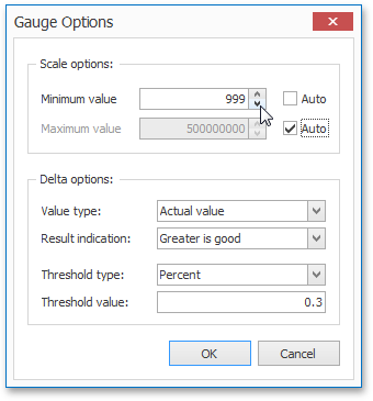
These buttons invoke the Gauge Options dialog.
Use it to define the condition for displaying delta indication, specify which delta values should be displayed, and introduce the comparison tolerance.
Delta Values
You can specify which values should be displayed within gauges. Use the Value type combo box in the Gauge Options window to select the value that will be displayed as the delta value.
| Value Type |
Result |
|
Actual Value |
|
|
Absolute Variation |
|
|
Percentage Variation |
|
|
Percentage of Target |
|
Delta Indication
You can specify the condition for displaying delta indication. To do this, use the Result indication combo box in the Gauge Options window.
Greater is Good: The 'good' indication is displayed if the actual value exceeds the target value; if the target value exceeds the actual value, the 'bad' indication is displayed.
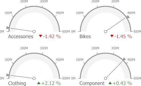
Less is Good: The 'bad' indication is displayed if the actual value exceeds the target value; if the target value exceeds the actual value, the 'good' indication is displayed.
No Indication: Indication is not displayed.
Warning if Greater: A warning is displayed if the actual value exceeds the target value; otherwise, no indication is displayed.
Warning if Less: A warning is displayed if the target value exceeds the actual value; otherwise, no indication is displayed.
Comparison Tolerance
The comparison tolerance allows you to create more advanced conditions for displaying delta indication. For instance, you can specify that a specific indication should be displayed when the actual value exceeds the target value by 10% or by $2K.
Use the Threshold type combo box to select whether you wish to specify the comparison tolerance in percentage values or in absolute values. Then use the Threshold value box to specify the comparison tolerance.
Gauge Scale
By default, the Gauge dashboard item automatically determines the range of the gauge scales based on the values they display.
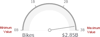
You can override this behavior and specify the maximum and minimum values on the scale.
To do this, invoke the Gauge Options window using the Options button displayed in the data item container in the Gauges section of the Data Items pane.
In the Gauge Options window, uncheck the Auto check box for the maximum or minimum value, and specify this value in the corresponding field.
Interactivity
This section describes features that enable interaction between the Gauge dashboard item and other items. These features include Master Filtering and Drill-Down.
Master Filtering
The Dashboard allows you to use any data aware dashboard item as a filter for other dashboard items (Master Filter).
When master filtering is enabled, you can click a gauge (or multiple gauges by holding down the CTRL key) to make other dashboard items only display data related to the selected gauge(s).
To reset filtering, use the Clear Master Filter button (the  icon) in the caption of the Gauge dashboard item, or the Clear Master Filter command in the Gauges context menu.
Drill-Down
The built-in drill-down capability allows you to change the detail level of data displayed in dashboard items on the fly. When drill-down is enabled, you can click a gauge to view the details.
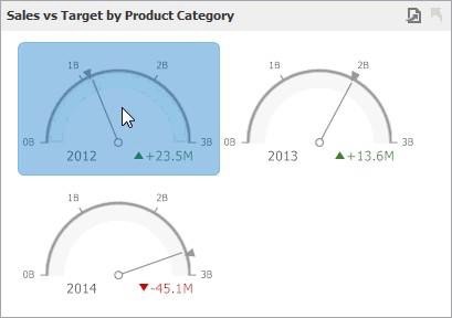
Drill-down requires that the Series section contains several dimensions, from the least detailed to the most detailed dimension.
To enable drill-down, click the Drill Down button in the Data Ribbon tab (or the  button if you are using the toolbar menu).
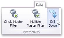
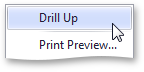
To return to the previous detail level (drill up), use the Drill Up button (the  icon) in the caption of the Gauge dashboard item, or the Drill Up command in the Gauges context menu.
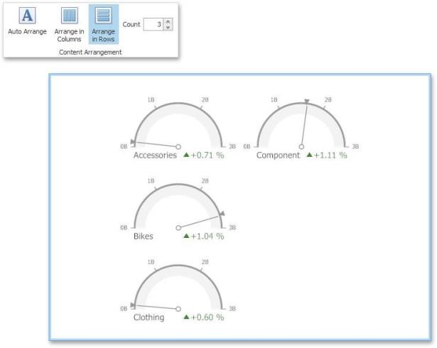
Layout
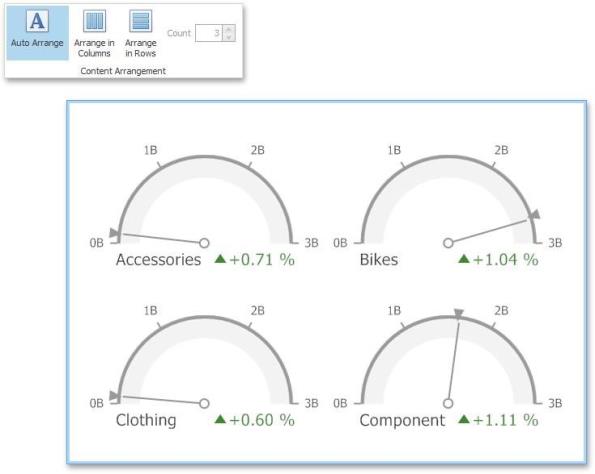
The Gauge dashboard item allows you to specify the number of columns or rows in which individual gauges are arranged.
To control how gauges are arranged, use the buttons in the Content Arrangement group of the Design Ribbon tab. By default, the Auto Arrange option is enabled, which automatically resizes gauges to fit within the dashboard item.
You can also specify the number of columns in which gauges are arranged. Click the Arrange in Columns button and specify the appropriate number in the Count field.
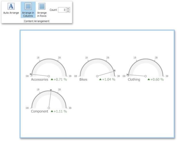
Similarly, you can arrange pies in a specific number of rows by clicking the Arrange in Rowsbutton.
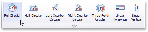
Style
The Gauge dashboard item allows you to select the gauge type. The following types are supported:
|
Full Circular |
|
|
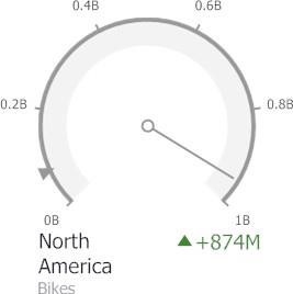
Half Circular |
|
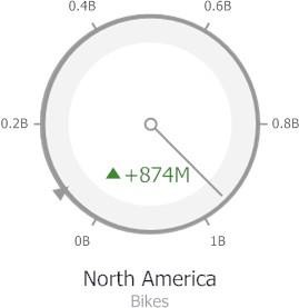
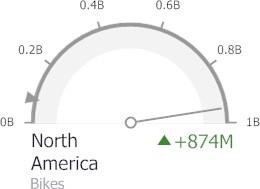
|
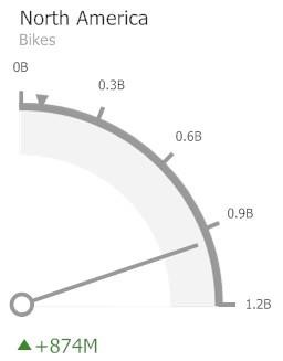
Left-Quarter Circular |
|
|
Right-Quarter Circular |
|
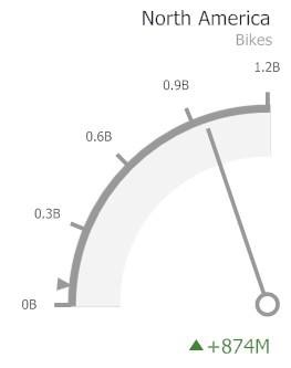
|
Three-Fourths Circular |
|
|
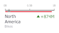
Linear Horizontal |
|
|
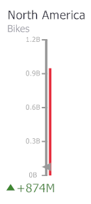
Linear Vertical |
|
To select the gauge type, use the buttons in the Style group of the Design Ribbon tab.