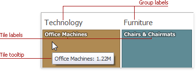
Use the Treemap dashboard item to visualize data in nested rectangles that are called tiles.
The Treemap displays labels that contain descriptions for tiles and groups, and provide tooltips with additional information.
Providing Data
The Dashboard Designer allows you to bind various dashboard items to data in a virtually uniform manner. The only difference is in the data sections that the required dashboard item has.
The Treemap dashboard item has the Values and Arguments data sections that provide numeric and discrete categorical data, respectively. The steps below provide the most common scenarios of binding a Treemap to data.
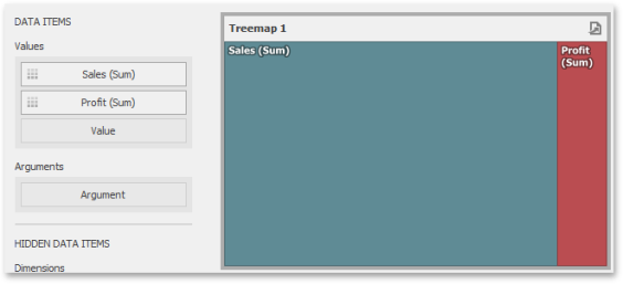
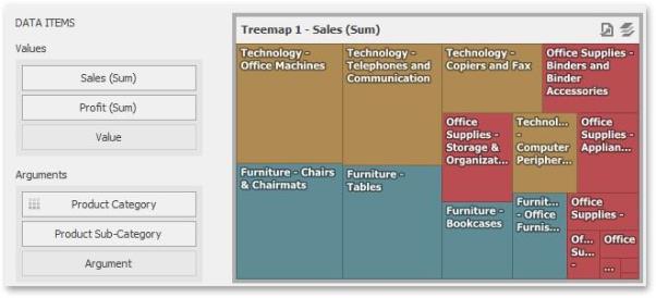
- Drop the Sales and Profit fields to the Values section. The Treemap will draw two tiles whose sizes correspond to the Sales and Profit summary values.
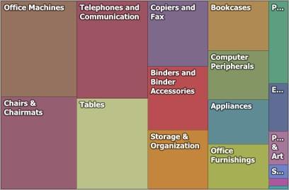
- Drop the Product Category field to Arguments. The Treemap will create individual tiles for all categories. You can switch between Sales and Profit values by clicking the icon
 in the item's caption or you can use its context menu.
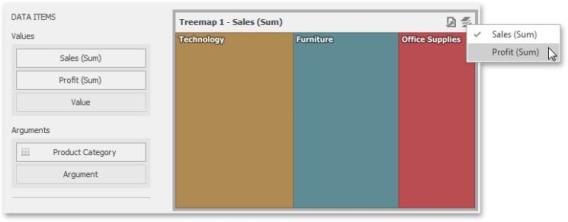
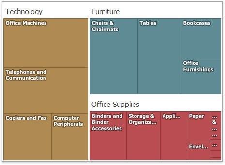
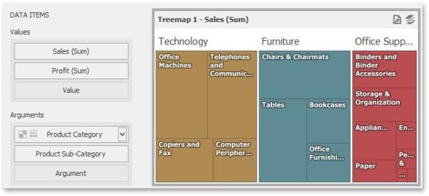
- Drop the child Product Sub-Category field into Arguments. The Treemap will visualize all combinations of categories and corresponding sub-categories using individual tiles.

-
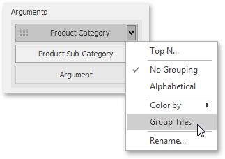
If the Arguments section contains several dimensions, you can group child tiles by values of the parent dimension. To group sub-categories inside corresponding categories, click the Category Name menu button and select Group Tiles. Sub-category tiles will be grouped into category groups.
Layout
This topic describes how to change a layout algorithm used to arrange Treemap tiles. To do this in the Designer, use buttons from the Layout group placed in the Design ribbon tab.
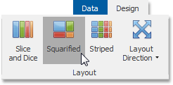
The following algorithms are available:
|
Algorithm |
Example | Description |
|
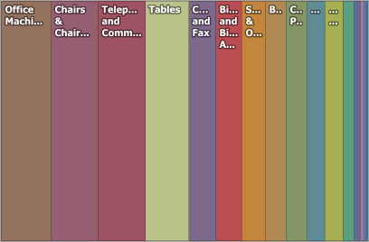
Slice and Dice |
|
This layout algorithm divides the space between items, slicing it in the specified direction depending on item value. |
|
Squarified |
|
The Squarified algorithm arranges tiles so that their width/height ratio will be closer to 1. |
| Striped |
|
This algorithm is a modified version of the Squarified algorithm. The difference here is that tiles are drawn side by side as columns or rows. |
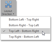
You can also set a layout direction to specify an arrangement of tiles depending on their sizes. To do this, click the Layout Direction button and select the required direction.
Grouping
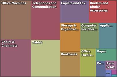
If you use several arguments in the Treemap, you can group tiles corresponding to child values by parent values. For instance, the following Treemap dashboard item displays combinations of categories and sub-categories.
To group sub-categories inside corresponding categories, click the Product Category menu button and select Group Tiles.
Product tiles will be grouped into category groups.
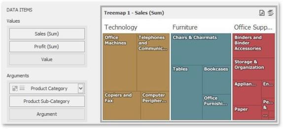
Note that the  icon will be displayed within the Product Category dimension.
Coloring
Certain dashboard items provide the capability to color dashboard item elements by associating dimension values/ measures and specified colors. You can choose whether to use a global color scheme to provide consistent colors for identical values or specify a local color scheme for each dashboard item.
By default, the Treemap dashboard item colors its tiles in the following way:
-
If the Treemap dashboard item contains only measures (the Values section), values corresponding to different measures are colored by hue.
-
If the Treemap dashboard item contains arguments (the Arguments section), values corresponding to the first argument are colored by hue.
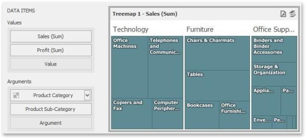
If necessary, you can change the default behavior. For instance, the image below shows the Treemap dashboard item whose measures and argument values are painted with the same color.
Labels
The Treemap displays labels that contain descriptions for tiles and groups, and provide tooltips with additional information.
You can specify which information should be displayed within tile and group labels separately. To do this, use the Labels and Tooltips buttons in the Design Ribbon tab.
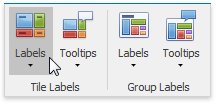
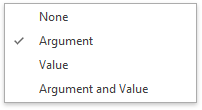
Use buttons within the Tile Labels/Group Labels ribbon groups to manage tile and group labels, respectively. These buttons invoke the drop-down menu, which is similar for all buttons.