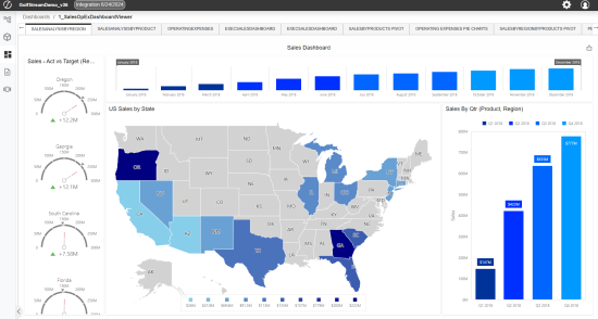
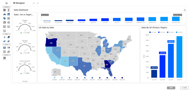
Dashboards
Functional coverage (with the goal of offering equivalent use of layouts and components available in the Windows application) continues to be expanded upon for dashboards in the Modern Browser Experience. Currently, the most commonly used features are available. For dashboards that contain elements that have not yet been delivered or expose issues that may arise through use of unique design techniques, there are typically design and configuration changes or workarounds that can be utilized to achieve the same goals until subsequent releases close those particular, functional gaps.
While browser capabilities move toward comprehensive end user dashboard functionality and parity between the Windows application and the Modern Browser Experience, different, underlying technologies utilized to develop the clients will potentially prevent exact replication of dashboards in both clients. Additionally, the architecture used to support interface styling is different between the clients, causing dashboards designed for one client to look dissimilar when rendered in another.
If a preexisting dashboard contains only supported layouts and components, it can be enabled for use with a single configuration. However, for an optimized user experience on the browser or on mobile devices, designers may consider modifying the dashboard or creating new client/device specific dashboards.
Enabling Dashboard Access
To ensure dashboards are only rendered within the client (Windows application or browser) or device (PC, tablet, or phone), a new configuration has been added to the Dashboard Profile called Client/Device Visibility.
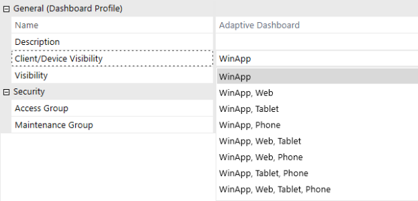
The Client/Device Visibility configuration enables dashboard designers to control which dashboard profiles, and the dashboards they contain, can be accessed and viewed on one or more clients and devices. Enabling this configuration will display the dashboard in the OnePlace Dashboard list of the respective client/device selection.
Preexisting and newly created dashboards will be set to the Windows application only by default. Dashboards are not initially visible. Dashboards always render in Workflows.
Notable Differences from Windows Application
Dashboard Components
BI Viewer
You may observe style differences, like muted borders and headers, or alternative style visualizations.
BI Viewer sometimes shows infinite loading screens in Browser that are driven by differences in how the component reads configurations.
| Observed Behavior | Cause | Resolution |
| Infinite Loading Screen Appears | A filter is set to a question mark (?). | Update the filter to be set to an empty string. Validated in browser and WinApp. |
| Infinite Loading Screen Appears | A Calculated Field is set to a decimal without a leading zero. (Example: .2). | Update the filter to include a leading zero. (Example: 0.2) Validated in browser and WinApp. |
BI Viewer Designer
BI Viewer Designer allows users to modify components directly in the Modern Browser Experience without navigating back to the Windows Application. The BI Designer Interface is currently only available to users who have permissions to edit the dashboard. Depending on the BI Viewer configurations, users may open the BI Designer Interface using the following methods:
-
If the BI Viewer has a title, then a pencil icon will appear on the right side of the title bar.
-
If the BI Viewer does not have a title, then a pencil icon will appear in a hover-over menu on each component.
BI Viewer Designer includes most of the same functions available in the Windows Application in a new browser-optimized layout. Component settings, like save or data sources, are found in the upper left menu. Users can add components using the tool bar at the left. Each component includes its own hover-over menu to modify component-specific settings. The browser BI Viewer Designer does not support adding data adapters or creating BI Viewer components from scratch. These steps must be done in the OneStreamWindows Application before they can be modified in the browser. See BI Viewer Designer documentation for more information.
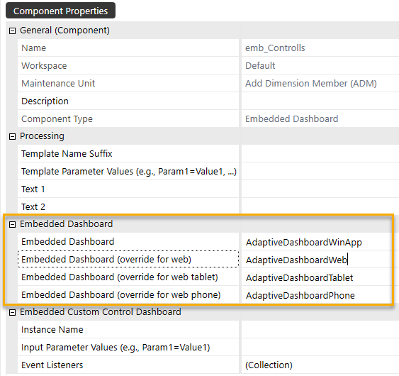
Embedded Dashboards
New client/device specific dashboards configurations allow a single root dashboard to render different embedded dashboards depending on the client or device type. (More details on the use of this configuration are described within the Multi-Client/Device Dashboard Design Approaches below)
Text Box
The Find and Replace formatting options are currently not available when using Rich Text in the Modern Browser Experience.
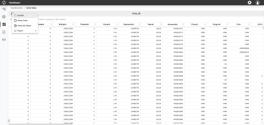
Grid View
Grid options are now listed in a context menu.
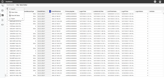
SQL Table Editor
Additional options are now listed in a context menu. Edited cells have minor style updates.
Large Data Pivot Grid & Pivot Grid
Pivot Grids in the browser now come with a streamlined configuration, and a modernized interface, while maintaining compatibility with existing workflows like the ability to drag and drop fields. Both Pivot Grids and Large Data Pivot Grids benefit from updated data processing that ensures all data is available for aggregation.
Notable Differences in Pivot Grids
-
In the Drill Down dialog box, the selected fields in the row and columns are displayed first, then the rest of the dimensions in alphabetical order and the amount field last.
-
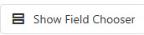
Field Controls are displayed in a floating dialog box and launch using the Show Field Chooser button in the upper right corner of the pivot grid. A count of total rows in the dataset is displayed on the top right of the pivot grid.
NOTE: This count will not change when filtering data, it will always display the total count of rows.

-
In the Field Chooser dialog box, you can select or clear any field in the All Fields section or drag and drop any field into the Row Fields, Column Fields, Data Fields or Filter Fields. Field selections update at real time once you select the OK button and close the Field Chooser dialog box. Filtering options are available for each field.
| Button | Action |
|
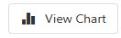
Displays bar chart above the grid. NOTE: Once the View Chart button is clicked, it changes to the Hide Chart button. |
|
Opens Field Chooser dialog box. |

|
Exports to an .xslx file. |
Charts in Pivot Grids
When the chart is displayed, you can hover the mouse over any of the bars for more information.
NOTE: Bar charts are the only available chart type at this time.
Keyboard Controls in Pivot Grids
A wide array of functions allow users to interact with Pivot Grids using keyboard shortcuts. See Appendix E for a full list of interactions.
Advanced Charts
There are some charts and configuration properties that are not currently supported. See Appendix A for a detailed breakdown.
Text Editor
The Text Editor feature mirrors almost all of the windows application functionality including: create, save, open, edit, rich text editing, insert, and layout functions. Additionally, OneStreamfunctions such as refresh documents, show field codes, and hide field codes are also available in the browser. One key difference of this feature is that the Review tab is not currently available.
Dynamic Grid
The Dynamic grid only contains the following filter drop-down values in the Modern Browser Experience:
-
Clear Filter
-
Contains
-
Does not contain
-
Is equal to
-
Is not equal to
-
Starts with
-
Ends with
NOTE: The Dynamic Grid in the Browser assumes certain UI functionality will be properly configured within the Dynamic Grid Assembly service to correctly display filtering, sorting and exporting as examples. If it’s not set up properly in the Dynamic Grid Assembly service there’s the potential the UI within the Browser will look broken for filtering, sorting, etc.
Filter Editor
The Filter Editor component gives users a visual interface for modifying and applying advanced logic to filters. While most operators are available in the browser, the following are not currently supported: Not And, Not Or, and Not Between (Numeric Values). Only Equals and Does Not Equal generate a data bound drop-down list. Other operators render a text box.
Maps
Hover-over images for shapes on Maps are not currently available.
Menu
Menu component images expand to fit all available space in the Modern Browser Experience. For consistent display between the Windows application and Modern Browser Experience, ensure that the image source being used is set to 96 DPI or that the ImageHeight and ImageWidth parameters within XFMenuItem are being utilized.
Spreadsheet
Web Content
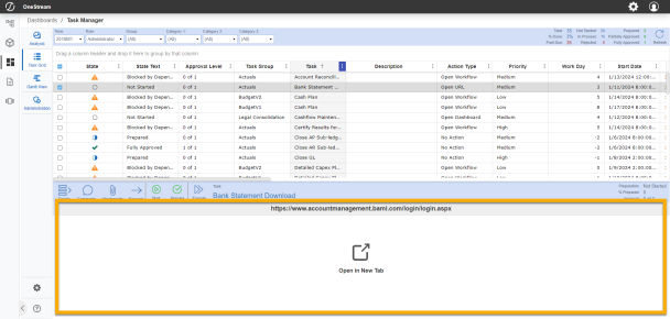
By default, Web Content is opened in a new tab in the browser. The content may also be rendered directly in a dashboard using an iframe by modifying the following component configuration:
-
Open Content in New Tab (Web Only) - Set the value of this field to "False" to open web content in an iframe.
NOTE: Not all websites are compatible with iframes and some may be blocked from rendering in an iframe. Thorough testing of all use cases for Target URLs is strongly encouraged.
Notable Dashboard Functionality Gaps
Dashboard Layouts
|
|
|
Dashboard Components
|
|
|
|
Navigating Dashboard Gaps
Helpful tips have been added to both the Windows application and the Modern Browser Experience to assist dashboard designers and end users in identifying dashboard layouts and components that are not yet supported on the browser.
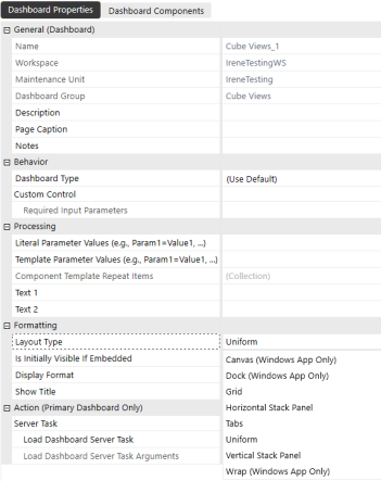
In the Windows application, labels for Windows App Only have been added to both the Dashboard Properties Layout Type and Dashboard Component selection lists.
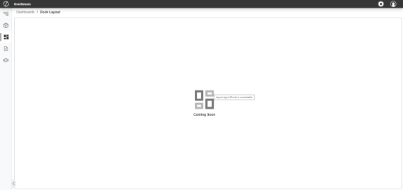
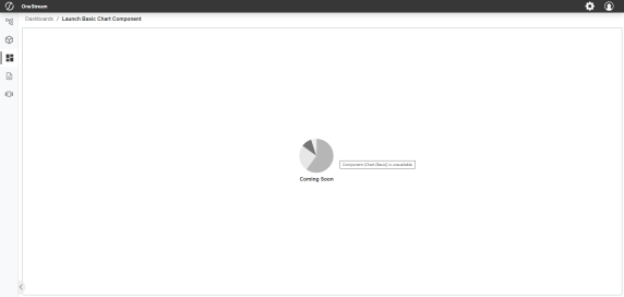
A placeholder image indicates if the dashboard layout or component is not currently supported. A hover tooltip specifies the layout or component that is not rendering.
Even if all dashboard layouts and components are supported, we still recommend conducting a full regression test of any dashboard that is being transferred from the Windows application to the browser to ensure functional parity before production use.
Dashboard Design Process
When building a dashboard for browser use, designers should open both their Windows application and Modern Browser Experience simultaneously. Using the Windows application, designers can update and save dashboard configurations. To view reflected changes, simply refresh the browser.
When building a dashboard for use on a tablet or phone, designers can follow the same process, using either a physical device or mobile device emulator in a browser. Designers should make sure they log into their browser environment with the emulator properly sized to ensure the browser experience reacts to the device it is emulating.
As with the Windows application, using dashboard design best practices can significantly improve the performance of a dashboard. The browser experience may have performance sensitivities that differ from the Windows application.
Dashboard Accessibility Design Approaches
OneStream Dashboard components are configured to support standard accessibility guidelines, allowing for users to navigate through elements using the keyboard and for screen readers to convey element names, contextual roles, and values (as applicable). Element names are conveyed based on a component's configured name or description and the component type reflects the role..
The following optional dashboard components have some accessibility limitations:
-
Advanced Charts
-
BI Viewer
-
Filter Editor
-
Map
-
Large Data Pivot Grid
-
Pivot Grid
-
Text Editor
Dashboards are highly customizable so it is important to design with accessibility in mind, leveraging properties such as font, color, sizing, and use of parameters, among many others.
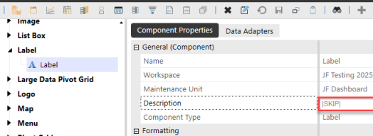
Image and Label dashboard components can now be configured to skip through UI elements that don't contain content while using keyboard controls to navigate. To configure an Image or Label component so it can be skipped, type |SKIP| in the description field of the component in the Component Properties tab.
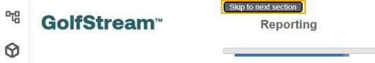
Additionally, keyboard users will see a link appear when they bring focus to an embedded dashboard that enables them to move past the content contained in that dashboard and navigate directly to the next embedded dashboard in the page, providing additional efficiency by allowing for quicker navigation through content-rich dashboards.
Multi-client/Device Dashboard Design Approaches
When designing a dashboard that will be used across multiple clients or devices, dashboard designers can use three different approaches to find the right balance of upfront effort, end-user optimization, and maintenance effort that best suits their needs.
Approach 1: Unified Multi-client/Device Dashboards
This approach uses a single non-adaptive dashboard. The designer will most likely have to make compromises to make it usable for each client/device type. These compromises typically result in a simplified dashboard with efficient maintenance. This type of dashboard needs to have the proper combination Client/Device Visibility configurations to be accessible from the OnePlace Dashboard across clients and devices. It can be more difficult for multi-device use due to varying space for dashboard components, but it is an effective way to access dashboards initially. Designers can rely on this approach to update existing Windows application dashboards for use. For more complex scenarios, designers should consider building client/device specific dashboards or adaptive dashboards.
Approach 2: Client/Device Specific Dashboards
This approach uses multiple non-adaptive dashboards. Designers create separate dashboards that render equivalent information and functionalities but have different designs that are optimized for specific client and device types. These dashboards need to be added to separate dashboard profiles. Each of the dashboard profiles have different Client/Device Visibility configurations, which limits their visibility in the OnePlace Dashboard list to only the appropriate client or device they were designed for. This approach offers an optimized user experience and low design complexity, but it has a high maintenance effort.
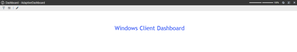
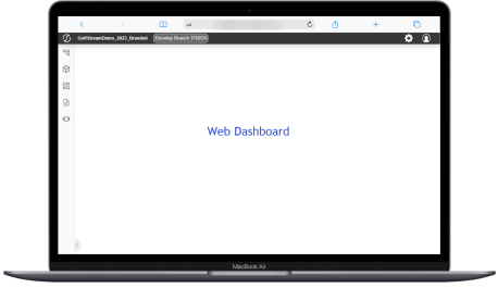
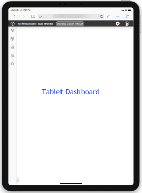
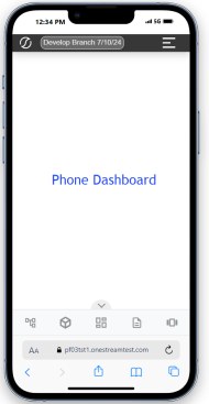
Approach 3: Client/Device Adaptive Dashboards
This approach uses a single adaptive dashboard. Designers need an initial understanding of how their dashboard should adapt to each client or device type intended for use. The designer creates Embedded Dashboards with configurations that link to client/device specific dashboards. The Embedded Dashboards can be placed at any level within nested dashboards allowing designers to easily customize components shared across multiple devices or create unique experiences per device type. This approach offers a highly optimized user experience and lower maintenance effort, but it has high design complexity.
Current dashboards that have been designed previously for the OneStream Windows application may need to be redesigned for an optimized user experience on the browser or alternative device types.


