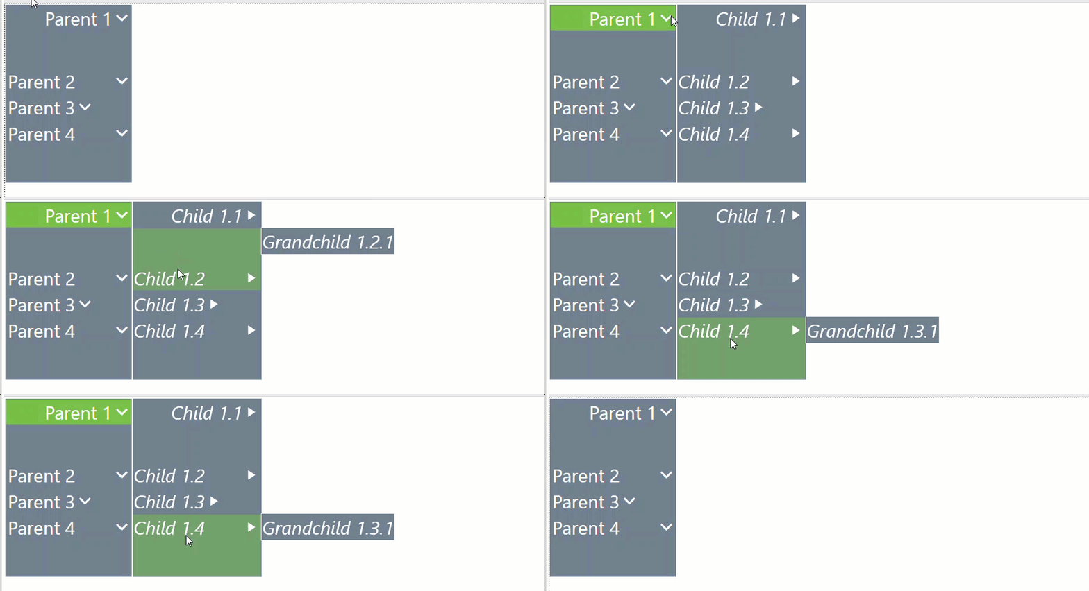
Menu Component and Items
The Menu Component has the following options you can integrate and use within your navigational menu. As the developer, you can set the Menu Items through the Workspace Assembly or Business Rule code. The Workspace Assembly or Business Rule code containing Menu Items can then be used to populate the Data Table within a Data Adapter. You can configure specific Display Format settings for the main Menu Components through the Display Format Properties dialog. A Custom Parameter can also be included in the Display Format Properties dialog to configure the main Menu Component.
Menu Component Properties
Auto Open
Defaults to False. When Auto Open is set to False, you must click each Menu Component Item to expand its nested children. When Auto Open is set to True, the Menu Component Menu Items will automatically expand its nested children when you hover the cursor over the item.
Show Down Arrow
Defaults to False. When Auto Open is set to False, it will not display an arrow icon on the top-level Menu Items even if they contain nested children. When Show Down Arrow is set to True, it will display the arrow icon on the top-level Menu Items containing nested children.

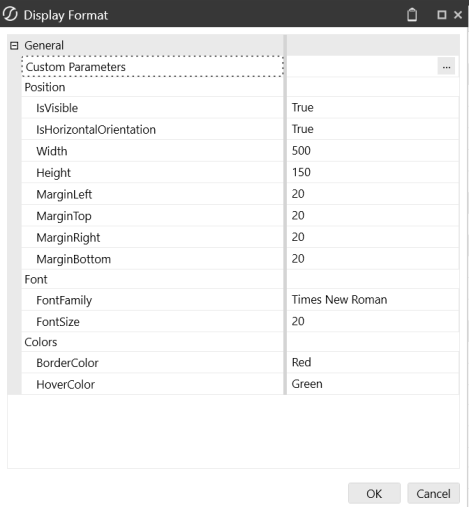
Display Format Properties
General
-
Custom Parameters: Use this property to use parameters from the following locations: Default Workspace and Non-Default Maintenance Unit or Non-Default Workspace and Maintenance Unit. You can enter the name of a Parameter that contains a string specifying Display Format settings into this property.
Position
-
IsVisible: Defaults to (Use Default). Select (Use Default), True, or False to determine if the component is visible on the dashboard.
-
IsHorizontalOrientation: Defaults to (Use Default). Select (Use Default), True, or False.
-
Width: Enter a width number.
-
Height: Enter a height number.
-
MarginLeft: Enter a margin left number.
-
MarginTop: Enter a margin top number.
-
MarginRight: Enter a margin right number.
-
MarginBottom: Enter a margin bottom number.
Font
-
FontFamily: Enter a font family name.
-
FontSize: Enter a font size number.
Colors
-
BorderColor: Defaults to (Use Default). Select a color, enter a custom color, or use the default value.
-
HoverColor: Defaults to (Use Default). Select a color, enter a custom color, or use the default value.
Nested Menus
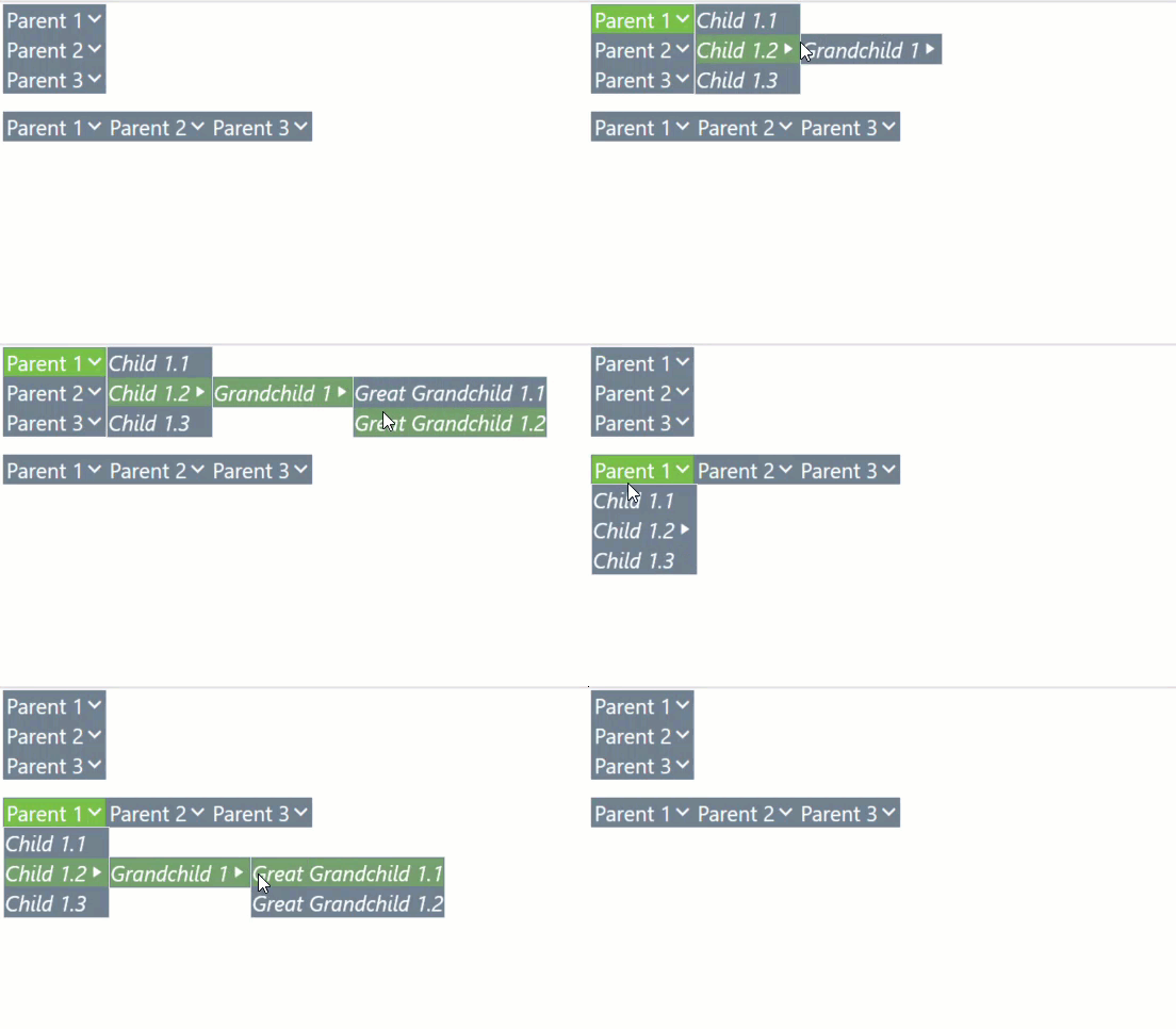
You can create nested menus with the Menu Component. A nested menu is a menu item with a submenu. This can be displayed at any nested level depth.
NOTE: Parent menu items cannot have more than four nested child levels.

Enable or Disable Menu Items
You can set specific menu items in a Menu Component to Enabled or Disabled. When set to Disabled (bool isEnabled = false), you cannot click on or select that menu item. Both parent and child menu items can be set to Enabled or Disabled.

Vertical or Horizontal Menus
You can display menu components in a vertical or horizontal format. This property is configured in the Display Format Properties dialog.
Width and Height
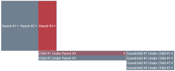
You can configure the overall Menu Component's width and height along with setting each individual menu item's width and height. The width or height of the overall Menu Component displayed on the dashboard are set in the Display Format Properties dialog. The width or height of individual Menu Items within the Menu Component are set through the Workspace Assembly or Business Rule code. Menu Item width and height can be specified at any nested level depth.
Images
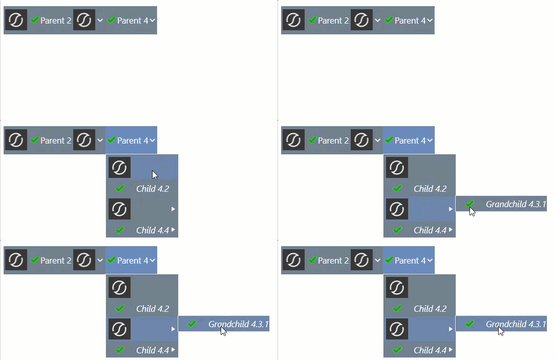
Images can be set to display within a Menu Component's parent and nested menu items. You can choose to display the image on its own within the menu item or along with header text or an arrow icon. If the menu item uses an image and the drop-down arrow, the image will always display to the left of the arrow.
NOTE: The arrow icon will only display for parent menu items if Show Down Arrow is set to True for the Menu Component and they contain nested items. Nested items under the parent menu items, or children, are not affected by this setting and will always display an arrow if they contain their own nested items.
NOTE: Menu component images expand to fit all available space in the Modern Browser Experience. For consistent display between the Windows application and Modern Browser Experience, ensure that the image source being used is set to 96 DPI or that the ImageHeight and ImageWidth parameters within XFMenuItem are being utilized.
Bold and Italic Menu Options
You can set the menu item text to be bold and/or italic in the Workspace Assembly or Business Rule code.

Tooltip
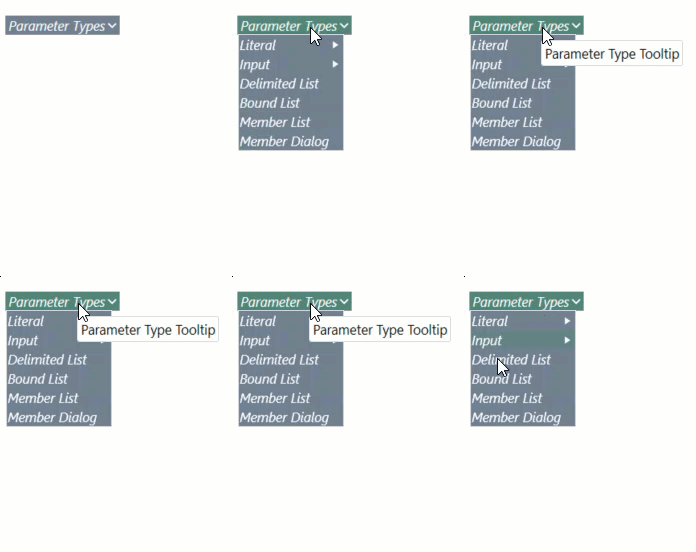
You can customize tooltips for the Menu Component's menu items. When the menu item has a set string for the tooltip, the text will display when you hover the cursor over that menu item.
Separators
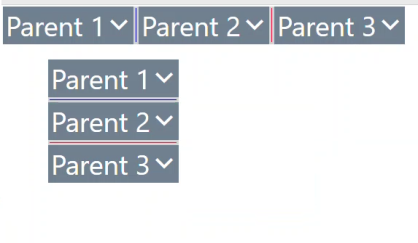
You can set and create horizontal and vertical separators within the Menu Component. Separators are their own individual menu items set through Workspace Assembly or Business Rule code and can be listed anywhere in the Menu Component. When the isSeparator arguments is set to True on an XFMenuItem class, then it ignores most settings except for the color formatting options. If the Menu Component is horizontal, all Separator menu items created at the parent/root level will be vertical, and vice versa. Nested separators always display horizontally between child items.
Text Color for Background and Text Color Styles
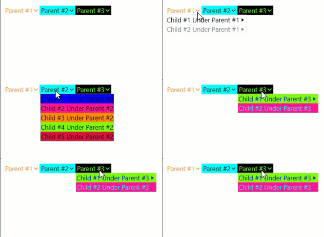
You can customize the text, background, and border colors. This can be displayed at any nested level depth.
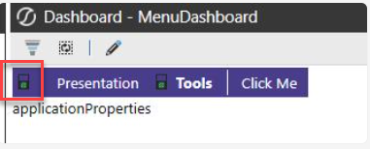
Toolbar Image Menu
You can also convert navigational menus into toolbars with image icons. You can omit header text and configure the width, height, and padding properties in the Workspace Assembly or Business Rule code to achieve this. You can also pull images from Dashboard Files, Client Images, and URLs.
Padding Options
You can add and set padding for each menu item. The padding settings are set in the Workspace Assembly or Business Rule code (PaddingLeft, PaddingTop, PaddingRight, and PaddingBottom) and can be set for each individual menu item.
