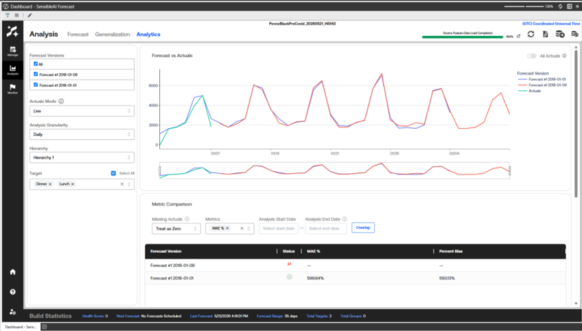
The Analytics page lets you compare one or more forecast versions against actuals in a single place. Use the sidebar on the left to choose what to analyze, then review the results across three panels: the Forecast vs Actuals timeline chart, the Metric Comparison table, and the Growth Rate Analysis panel. The sidebar settings apply to all three panels at the same time. Each panel also has its own settings that change only that panel. The analytics shown for a Forecast is from the effective model set from the Monitor System.
Configure the Analysis
The sidebar controls what every panel on the page shows:
-
Forecast Versions: Check one or more forecast versions to include them in every panel. Use All to select or clear every version at once. Each version you select appears as its own series in the charts and its own row in the tables.
-
Actuals Mode: Controls how actuals are matched to the forecast, and defaults to Live. Point in Time scopes actuals to exactly the dimensions the forecast was originally responsible for, which gives the most accurate picture of forecast accuracy. Live reads actuals directly without joining to the forecast dimensions, showing where the business was truly heading, including signals SensibleAI may not have had visibility into at forecast time.
-
Analysis Granularity: Sets the time grain used to resample every panel: Daily, Weekly, Monthly, Quarterly, or Yearly. The page defaults to Monthly.
-
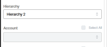
Hierarchy: Selects the rollup level for the analysis and defaults to the broadest hierarchy. Choosing a hierarchy determines which dimensions are available. Only the dimensions that belong to the selected hierarchy stay active, and any dimension that is not part of that hierarchy is grayed out below.
-
Dimension filter: Below the hierarchy, each dimension has its own searchable filter named for that dimension, for example, Target or Account. Pick specific values to narrow every panel to that slice, or use a dimension Select All checkbox to include all its values. Dimensions that are not part of the selected hierarchy appear grayed out and cannot be edited until you select a hierarchy that includes them.
Forecast vs Actuals (Timeline Chart)
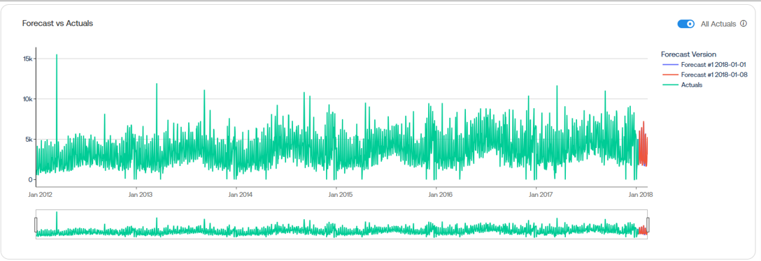
This panel plots each selected forecast version and the actuals as lines over time, with a range slider beneath the chart for zooming into a date window.
All Actuals
This switch is off by default. When it is on, the chart shows the complete actuals timeline across the entire dataset, independent of which forecast versions are selected. Leave it off to see actuals only for the window covered by the selected forecasts, or turn it on to see the full actuals history for context.
Metric Comparison
This panel shows one row per selected forecast version, with a color-coded Status indicator and a column for each selected metric, so you can rank versions by accuracy at a glance.
-
Missing Actuals: Controls how periods with no actual value are handled in the metric calculations and defaults to Treat as Zero. Treat as Zero counts missing actuals as 0 in all metric calculations. Drop from Calc excludes those periods entirely, which prevents missing values from inflating the error metrics.
-
Metrics: Chooses which accuracy metrics to display. Available metrics are Bias, WAPE, MAE, MSE, RMSE, Percent Bias, MAE %, MAPE, Total Forecast, and Total Actuals. The table opens with MAE % and Percent Bias selected.
-
Analysis Start Date and Analysis End Date: Set the calculation window for the metrics. Only data within this window is used to compute the metrics for every version.
-
Overlap: Select Overlap to snap the analysis window to the dates where the selected forecast versions and the actuals overlap. Select it again to clear the dates and return to the full range.
How Metrics Are Calculated in Forecast Analytics
This document explains every metric shown in SensibleAI Forecast Analysis > Analytics and how the denominator ("number of predictions") is defined.
What Counts as a "Prediction"
A prediction is one forecasted value for one target on one date, within a single selected forecast version.
Number of Predictions = Number of Targets x Number of Dates
-
The Forecast Versions drop-down selects a single forecast run to analyze. All metrics on that view are scoped to that one version.
-
If your scope has 5 targets and a forecast spanning 20 dates (after resampling to the selected frequency — daily, weekly, monthly, etc.), that's 100 predictions.
-
Dates here are resampled periods, not raw source-frequency dates. A daily forecast resampled to monthly counts each month once, not each day, so 2 targets over 1 resampled month is 2 predictions, not 62.
-
If a target is missing a forecast or actual on a given date, it doesn't count toward that date's target count for that date.
This denominator is used consistently across MAE, MSE, and RMSE , see note in MAE% (Percent MAE)
Total Forecast
Formula: SUM(Forecast)
Total Actuals
Formula: SUM(Actual)
Bias
Formula: SUM(Forecast) - SUM(Actual)
The signed total error. Positive means the model over-forecasts overall; negative means it under-forecasts overall. A low Bias doesn't guarantee an accurate forecast, always pair with an error-magnitude metric like MAE.
Absolute Error
Formula: |SUM(Forecast) - SUM(Actual)|
Bias without the direction.
MAE (Mean Absolute Error)
Formula: SUM(|Actual - Forecast|) / Number of Predictions
Same units as the underlying data (for example: off by 50 units on average). Treats over- and under-predictions equally.
MSE (Mean Squared Error)
Formula: SUM((Actual - Forecast)^2) / Number of Predictions
Penalizes large errors more heavily than MAE, in squared units. There is no percentage version of MSE in Forecast Analytics.
RMSE (Root Mean Squared Error)
Formula: SQRT(MSE)
Same units as the original data, still penalizes large errors more than MAE.
Bias% (Percent Bias)
Formula: (SUM(Forecast) - SUM(Actual)) / SUM(Actual)
Bias as a percentage of total actuals. Undefined (blank) when Total Actuals is zero.
MAE% (Percent MAE)
Formula: SUM(|Actual - Forecast|) / SUM(Actual)
MAE as a proportion of total actuals, scale-independent and comparable across targets.
NOTE: This uses a different denominator than plain MAE (total actuals, not prediction count). Undefined when Total Actuals is zero.
MAPE (Mean Absolute Percentage Error)
Formula: AVERAGE(per-period SUM(|Actual - Forecast|) / per-period SUM(|Actual|)) x 100
Averages the per-period percentage error, across resampled periods. Periods with zero actuals are excluded from the average. Undefined when no valid periods exist.
WAPE (Weighted Absolute Percentage Error)
Formula: SUM(|Actual - Forecast|) / SUM(|Actual|)
Weights each observation by magnitude, larger actual values contribute proportionally more. Undefined when the sum of absolute actuals is zero.
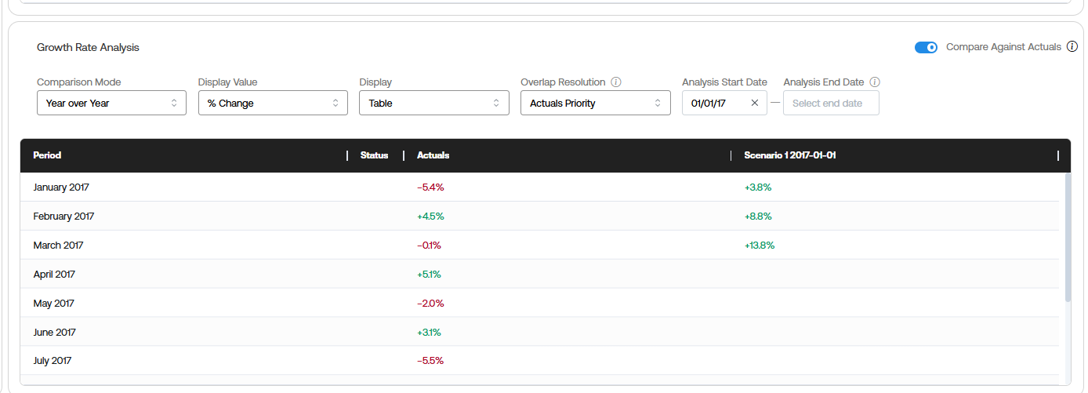
Growth Rate Analysis
This panel compares period-over-period growth for the selected forecast versions, shown as a table or a bar chart.
-
Compare Against Actuals: This switch is on by default. It includes an Actuals series alongside the selected forecast versions so you can compare forecasted growth with actual growth.
-
Comparison Mode: Sets how periods are compared: Year over Year (default), Quarter over Quarter, Month over Month, Custom Period over Period, or Custom Periods.
-
Display Value: Shows growth as % Change (default) or Absolute change.
-
Display: Renders the results as a Table (default) or a Bar Chart.
-
Overlap Resolution: Controls how the prior-period baseline is built where forecast and actuals overlap, and defaults to Actuals Priority. Actuals Priority replaces forecast values with actuals (including 0-filled actuals) wherever actuals exist in the prior period. Forecast Only keeps the original forecast values for the prior-period baseline even when actuals are available.
-
Analysis Start Date and Analysis End Date: Filter the growth-rate calculation window for the Year over Year, Quarter over Quarter, Month over Month, and Custom Period over Period modes.
-
Prior Period Timestep: Available in Custom Period over Period mode. Sets how many periods back, at the current Analysis Granularity, to use as the comparison baseline (1 to 36; default 1). A read-only badge shows the active Analysis Granularity.
-
Custom Periods: In Custom Periods mode, select + Add Period to define your own comparison windows. Each period has a Period Name, a prior range (Prior Period Start and Prior Period End), and a current range (Period Start and Period End), with Remove to delete the row.