Text Viewer
This is used to view text and rich text documents similar to those created in Microsoft Word. This is available in the OneStream Windows App version. Documents cannot be created or edited using this tool.
Spreadsheet
This is used to display spreadsheet files created with the Spreadsheet feature in a Dashboard. See Spreadsheet in Application Tools for more information.
NOTE: There are some configuration changes necessary for the Spreadsheet referenced in a Dashboard if functions such as XFGetCell or XFSetCell are included in that XLSX file that reference a custom Parameter that is driven by the Dashboard.
In this case, the function available to Excel Add-in and Spreadsheet called XFGetDashboardParameterValue should be used. If that function is used within an XLSX file that is using a function like XFGetCell or XFSetCell (or similar) where these are referencing a custom parameter value (e.g. ParamEntity) that is on the Dashboard that references this Spreadsheet from within it as a Component.
The practice to get this Custom Parameter value is to use XFGetDashboardParameterValue to fetch the text from that Parameter or its default value and place it in a cell on the Spreadsheet (e.g. B1). Then the cell that is using a retrieve function such as XFGetCell would reference this other cell (i.e. B1).
Spreadsheet
Show Toggle Size Button
Select True to enable the toggle button and allow users to toggle the size of the Component at run time, select False to hide the toggle button.
File Source Type
Dashboard File
Display a file stored in a Dashboard Maintenance Unit File section.
Application/System Database File
Display a file stored in the Application or System Database Share.
File Share File
Display a file from the File Share.
Url or Full File Name
Displays the URL or Full name of the file being used.
Process Extensible Document
Defaults to True. It will process Extensible Documents when embedded in a dashboard.
Refresh Spreadsheet When Opened
If set to True, will automatically refresh the spreadsheet file when it is opened.
Allow Create File
If set to True, allows users to create spreadsheet files.
Allow Open File
If set to True, allows users to open spreadsheet text files.
Allow Save File
If set to True, allows users to save spreadsheet files.
Allow Submit Data
If set to True, the Submit button on the Ribbon is enabled and users can load data to the forms channel.
Allow Calculate Data
If set to True, the Calculate button on the Ribbon is enabled and users can call calculate options using it.
Show Ribbon
Select True to enable users to see the Ribbon below the Menu Bar, select False to hide the Ribbon.
State Indicator
This is used to indicate a specific status on a Dashboard. This Component is not compatible with Mobile Dashboards.
Formatting
See Label
Data Table Cells from Adapter
See Label
States
State Indicator Type
The type of image used for indicating the status. Valid states start at index 0 and include the following:
Lamp
Off, Green, Yellow, Red
Arrow
Up, Down, Left, Right Arrow is displayed
Smile
Very Happy, Happy, Neutral, Sad
Traffic Lights
Off, Green, Yellow, Red
Default State Index
The default state is 0-4.
State Selection Type (Image = Off)
Specify the State selection type and then define the Minimum Amount, Maximum Amount and/or a list of comma-separated text items that the value from the first Data Table Cell must satisfy in order for the State to be selected.
(Not Used)
The State is not used.
Minimum Amount
The minimum amount for the State to be selected.
Minimum Amount Inclusive
The minimum amount including the specified value for the State to be selected.
Maximum Amount
The minimum amount for the State to be selected.
Maximum Amount Inclusive
The maximum amount including the specified value for the State to be selected.
Range
The amount between two values for the State to be selected.
Range Minimum Amount Inclusive
The amount between two values including the minimum amount for the State to be selected.
Range Maximum Amount Inclusive
The amount between two values including the maximum amount for the State to be selected.
Range Minimum and Maximum Amount Inclusive
The amount between two values including both the minimum and the maximum amount for the State to be selected.
Equals Text Item
If the string equals the string specified in the Text Items field, it should be selected for the specified State.
Starts with Text Item
If the value starts with the string specified in the Text Items field, it should be selected for the specified State.
Ends with Text Item
If the value ends with the string specified in the Text Items field, it should be selected for the specified State.
Contains Text Item
If the value is listed in the Text Items field, it should be selected for the specified State.
Minimum Amount
The value used in State tests for minimum amount.
Maximum Amount
The value used in State tests for maximum amount.
Text Items
The text values used in the types: Equals Text Item, Starts with Text Item, Ends with Text Item & Contains Text Item.
Web Content
This is used to display a URL or file embedded in a OneStream Dashboard. It can be used with Mobile and Application Dashboards.
NOTE: This component uses Microsoft Edge WebView2 Runtime to embed the web content. It must be installed on the client device. If the client device does not have it installed, you will receive an error when accessing a dashboard that is configured with a Web Content component.
Web Content Type
URL
The URL to a web page. This can be internal or external.
Dashboard File
The image displayed on the button is based on a file stored in the Dashboard Maintenance Unit File Section.
Application Database File
Display a file from the Application Database share.
System Database File
Display a file from the System Database share.
File Share File
Display a file from the file share.
URL or Item Name
Item to display (URL or file) in the control.
Show Header
Select True in order to display a header derived from the Component’s Name or Description.
Show Toggle Size Button
Select True to enable the toggle button and allow users to toggle the size of the Component at run time, select False to hide the toggle button.
Large Data Pivot Grid
The Large Data pivot grid is a dashboard component that lets you connect to external tables or large database tables for “pivot” style analytic reporting. The grid helps designers seamlessly integrate data from external tables into a OneStream environment through a dashboard for analytic reporting. The grid's paging and server based processing features support very large data sets/tables. In some cases, this component requires server configuration settings so users can access specific database tables.
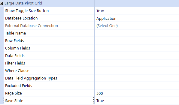
You can specify the following properties:
|
Property |
Setting |
|---|---|
|
Show Toggle Size Button |
True/False, to activate resize button. |
|
Database Location |
Identify the type of table location, External, Application or Framework |
|
External Database Connection |
Database Connection defined in the Application Server Configuration |
|
Table Name |
Table Name to be retrieved |
|
Row Field |
Comma-separated database column names to be placed in Row area by default |
|
Column Fields |
Comma-separated database column names to be placed in Column area by default |
|
Data Fields |
Comma-separated database column names to be placed in Data area by default |
|
Filter Fields |
Assign Dimensions as a default filter and assign filtering |
|
Where Clause |
Used to assign global filters to focus the returned results from the source table |
|
Data Field Aggregation Types |
List of comma-separated key value pairs that specify one aggregate function type per data field. Supported Sum, Average, Min and Max. |
|
Excluded Dimensions |
Allows Database Column Dimensions to be excluded from the Pivot |
|
Page Size |
Number of records returned in a page. Defaults to 500 with a maximum value of 3000. |
|
Save State |
Enables the Save Button on the Large Data Pivot Grid when set to True and Disables the Save button when set to False |