Cards
The Card dashboard item displays a series of cards. Each card illustrates the difference between two values. This difference can be expressed as an absolute value, an absolute variation or a percentage variation.
The Card dashboard item displays a series of cards. Each card illustrates the difference between two values. This difference can be expressed as an absolute value, an absolute variation or a percentage variation.
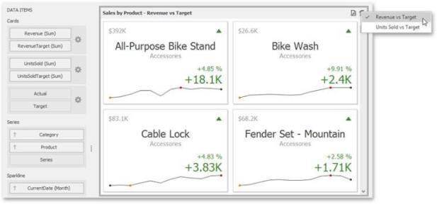
The Card dashboard item can illustrate this difference for various sets of values. You can switch between these sets using the Values button (the icon) in the dashboard item caption area or in the context menu.

A Card dashboard item can display a tooltip for cards containing a sparkline. When the mouse pointer is hovered over the sparkline, the tooltip can display start/end values and minimum/maximum values.

Providing Data
The Dashboard Designer allows you to bind various dashboard items to data in a virtually uniform manner.
The only difference is in the data sections that the required dashboard item has. This topic describes how to bind a Card dashboard item to data in the Designer.
Binding to Data in the Designer
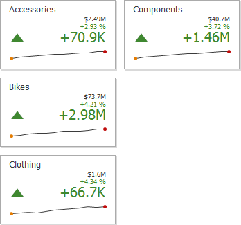
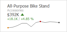
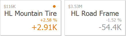
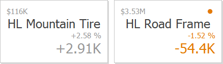
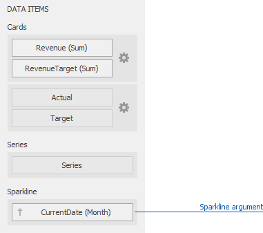
The image below shows a sample Card dashboard item that is bound to data.
To bind the Card dashboard item to data, drag and drop a data source field to a placeholder contained in one of the available data sections. A table below lists and describes Card data sections.
| Section | Description |
|---|---|
|
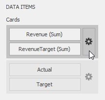
Cards |
Contains Data Items used to calculate values displayed within cards. Data Items are arranged in containers. Each data item container can hold two Data Items. The first item contains actual data and the second item (optional) contains target data. If both items are provided, cards show the difference between actual and target values. You can fill several data item containers in the Cards section and use the Values drop-down menu to switch between the provided values. To invoke the Values menu, click the icon in the dashboard item caption or use its context menu. This drop-down menu is available if the Series section is not empty. Otherwise, a separate card is created for each data item container, and all cards are displayed simultaneously. |
|
Series |
Contains Data Items whose values are used to label cards. |
|
Sparkline |
Provide a dimension whose data will be used to visualize values using sparklines. |
Layout
The Card dashboard item allows you to manage the position and visibility of elements displayed on cards. These elements include actual and target values, a delta indicator and corresponding delta values, a sparkline, etc.
To manage the position and visibility of card elements, choose a predefined layout template and customize its settings.
Available Layout Templates
The table below contains information about the available layout templates:
| Layout Type | Example | Description |
|---|---|---|
|
Stretched |
|
The Stretched layout template arranges card elements so that they occupy an entire card area. |
|
Centered |
|
The Centered layout template is used to center card elements so that they occupy a specified width/ height. |
|
Compact |
|
The Compact layout template is used to arrange card elements so that they occupy the minimum area. |
|
Lightweight |
|
The Lightweight layout template displays the minimum set of elements within a card. |
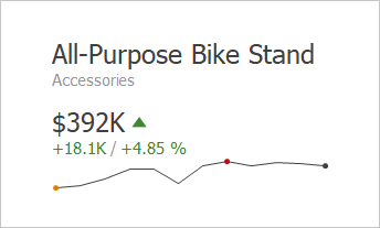
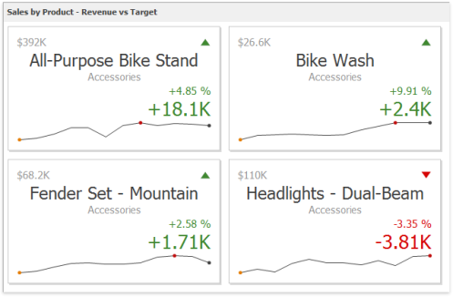
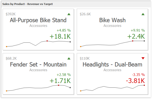
For all layout types, you can change the visibility of its elements, or you can specify the display value type for data- bound elements.
Default Layout
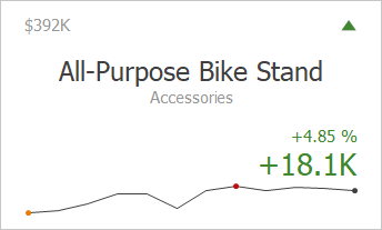
The Card dashboard item uses the Stretched layout template that arranges card visual elements in the following way by default.
Delta Indicator and delta values (such as Percent Variation or Absolute Variation) are colored depending on delta settings.
Change Layout
To change a card's layout in the Dashboard Designer, click the Options button (the  icon) displayed next to the data item container in the Cards section.
This invokes the Card Settings dialog.
On the Layout Options tab, select the required layout type in the Select template list and specify its settings:
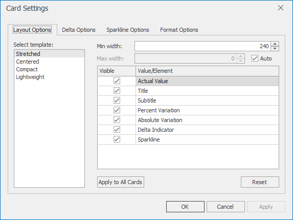
Min width: Specifies the minimum width of the card content.
Max width: Specifies the maximum width of the card content. Use the Auto option to determine the maximum width automatically.
You can show/hide the following values and visual elements within the card:
| Value | Description | Example |
|---|---|---|
|
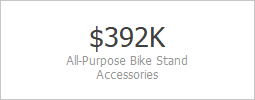
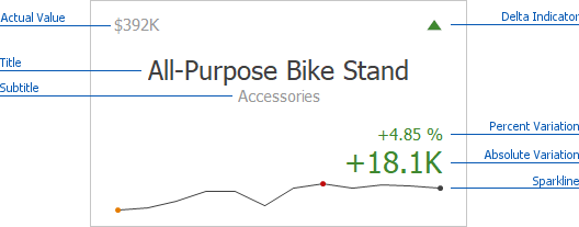
Title |
Displays values of the last (bottommost) dimension placed in the Series section. |
Microsoft Office Keyboard |
|
Subtitle |
Displays combined values of all dimensions except the last (bottommost) dimension. |
Technology - Computer Peripherals |
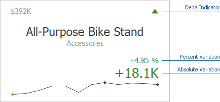
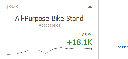
| Absolute Variation | An absolute difference between the actual and target value. | +1 8 .1 K |
| Actual Value | A summary value for a measure placed in the Actual placeholder. |
$ 3 9 2 K |
|
Card Name |
A card name. |
Revenue vs . Target |
|
Percent of Target |
A percent of a target. | 1 0 4 .8 5 % |
|
Percent Variation |
A percent difference between the actual and target value. |
4 .8 5 % |
|
Target Value |
A summary value for a measure placed in the Target placeholder. |
$ 3 7 4 K |
|
Dimension {Name} |
Allows you to display values of a specific dimension placed in the Series section. |
Technology |
| Element | Description | Example |
|---|---|---|
|
Delta Indicator |
Indicates whether the actual value is less or greater than the target value (see Delta). |
|
|
Sparkline |
Visualizes the variation of actual or target values. To learn more, see Sparkline. |
|


Use the Apply to All Cards button to propagate the specified layout settings to all cards corresponding to Actual-Target pairs. The Reset button resets all setting to their default values.
Delta
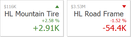
Cards allow you to visualize the difference between the actual and target values using special delta values and a delta indicator. If the default layout is used (Stretched layout type), the card displays the following delta values/ elements:
-
Delta Indicator: Indicates whether the actual value is less or greater than the target value.
-
Percent Variation and Absolute Variation: Delta values that show a difference between the actual and target value. You can also display the Percent of Target value. To do this, customize the card's layout.
To customize settings that relate to the calculation and display of delta values/elements, use the Options button (the icon) displayed next to the data item container in the Cards section.
In the invoked Card Settings dialog, go to the Delta Options tab.
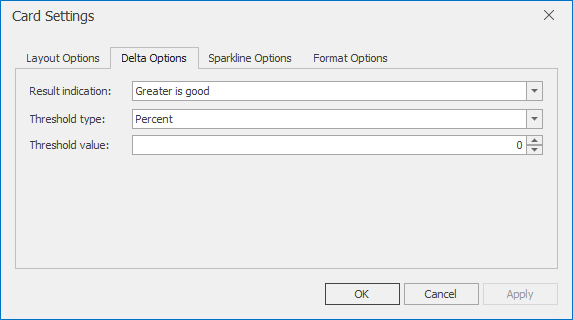
Then, specify the following settings:
Result Indication: You can specify the condition for displaying delta indication.
Greater is Good: The 'good' indication is displayed if the actual value exceeds the target value; if the target value exceeds the actual value, the 'bad' indication displays.
Less is Good: The 'bad' indication displays if the actual value exceeds the target value; if the target value exceeds the actual value, the 'good' indication displays.
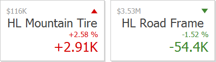
Warning if Greater: A warning is displays only if the actual value exceeds the target value
Warning if Less: A warning is displays only if the target value exceeds the actual value.
No Indication: Indication does not display.
Threshold type / Threshold value: For instance, you can specify that a specific indication should display when the actual value exceeds the target value by 10% or by $2K. Use the Threshold type combo box to select whether you wish to specify the comparison tolerance in percentage values or absolute values.
Then use the Threshold value box to specify the comparison tolerance.
Sparkline
Sparklines can be used to visualize the variation of actual or target values (for instance, over time).
Data Binding Specifics
You need to provide a date-time or numeric dimension whose data is used as argument values to display a sparkline within the card.
If you have provided both actual and target values, a sparkline visualizes the actual value's variation.
Change Sparkline Options
To manage sparkline settings, click the Options button (the icon) displayed next to the data item container. In the invoked Card Settings dialog, go to the Sparkline Options tab:
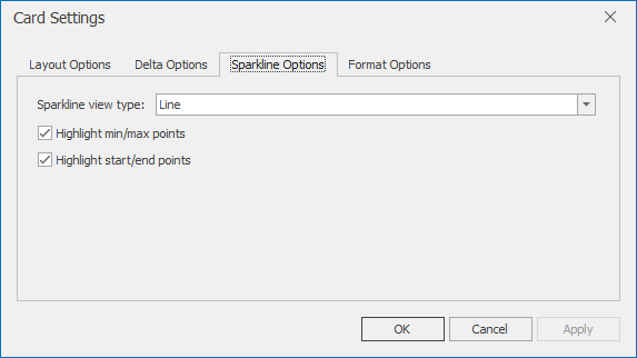
The following options are available:
| Sparkline Options | Description |
|---|---|
| Sparkline view type | Defines the sparklines view type. Sparkline data points can be represented as area, line, bars, or win and loss squares. |
| Highlight min/max points |
Specifies whether to highlight the minimum/maximum points of a sparkline. |
|
Highlight start/end points |
Specifies whether to highlight the start/end points of a sparkline. |
Formatting
The Card dashboard item formats the actual and target values displayed within cards using format settings specified for Data Items. Click the options buttons (the icon) displayed next to the data item container in the Cards section to change format settings for other values.
In the invoked Card Settings dialog, go to the Format Options tab and use the Select value type option to specify which values format settings should change.
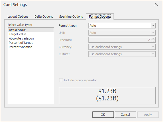
You can change format settings for the following value types:
-
Actual Value
-
Target Value
-
Absolute Variation
-
Percent of Target
-
Percent Variation
Interactivity
This section describes features that enable interaction between the Card dashboard item and other items. These features include Master Filtering and Drill-Down.
Master Filtering
The Dashboard allows you to use any data aware dashboard item as a filter for other dashboard items (Master Filter).
When Master Filtering is enabled, you can click a card (or multiple cards by holding down the CTRL key) to make other dashboard items only display data related to the selected card(s).
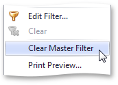
To reset filtering, use the Clear Master Filter button (the  icon) in the caption of the Card dashboard item, or the Clear Master Filter command in the Card's context menu.
Drill-Down
The built-in drill-down capability allows you to change the detail level of data displayed in dashboard items on the fly.
When drill-down is enabled, you can click a card to view the details.

When Master Filtering is enabled, you can view the details by double-clicking a card.
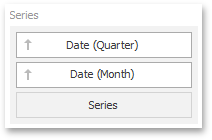
Drill-down requires that the Series section contains several dimensions, from the least to the most detailed dimension.
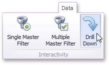
To enable drill-down, click the Drill Down button in the Data Ribbon tab (or the  button if you are using the toolbar menu).
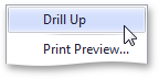
To return to the previous detail level (drill up), use the Drill Up button (the  icon) in the caption of the Card dashboard item, or the Drill Up command in the Card's context menu.
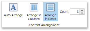
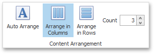
Cards Arrangement
The Card dashboard item allows you to specify the number of columns or rows in which individual cards are arranged.
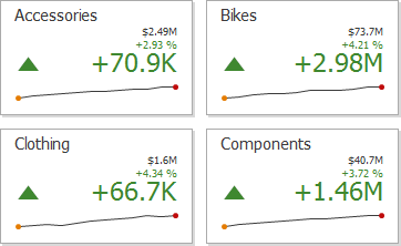
Use the buttons in the Content Arrangement group of the Design Ribbon tab to control how cards are arranged. The Auto Arrange option is enabled by default, which automatically resizes cards to fit within the dashboard item.
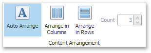
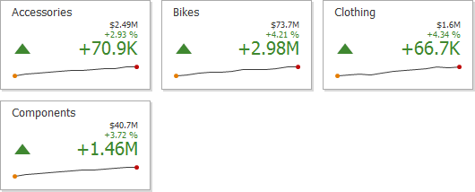
You can also specify the number of columns in which cards are arranged. Click the Arrange in Columns button and specify the appropriate number in the Count field.
Similarly, you can arrange cards in a specific number of rows.