Chart
The topics in this section describe the features available in the Chart dashboard item and provide extensive information on how to create and customize charts in the Dashboard Designer.
The Chart dashboard item presents data visually using different types of series.
A series represents a grouping of related data points. The most important characteristic of a series is its type, which determines a particular visual representation of data.
The Chart dashboard item includes the following series types:
-
 A Bar series displays data as sets of rectangular bars with lengths proportional to the values that they represent.
 -
 Point and Line series display data as standalone points or points joined by a line.
 -
 An Area series displays data by a line that joins points, and the shaded area between the line and the argument axis.
 -
 A Range series is the area between two simple series displayed as a shaded area, or bars that stretch from a point in one series to the corresponding point in another series.
 -
 A Weighted series displays data using a third dimension, expressed by a bubble's size.
 -
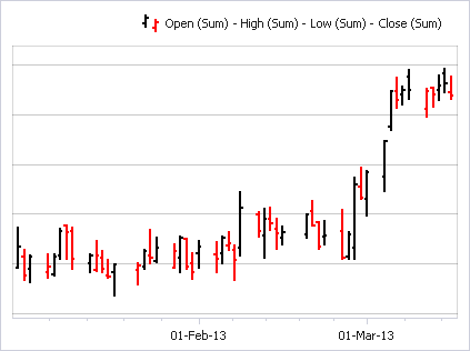
Financial series are useful in ananlyzing stock and bond prices as well as the behavior of commodities.
The Chart dashboard item can display a tooltip that shows information on a hovered series point.
Providing Data
The Dashboard Designer allows you to bind various dashboard items to data in a virtually uniform manner. To learn more, see the Binding Dashboard Items to Data topic.
The only difference is in the data sections that the required dashboard item has. This topic describes how to bind a Chart dashboard item to data in the Designer.
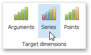
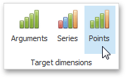
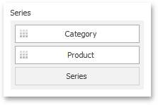
Binding to Data in the Designer Transposing Arguments and Series.
Binding to Data in the Designer
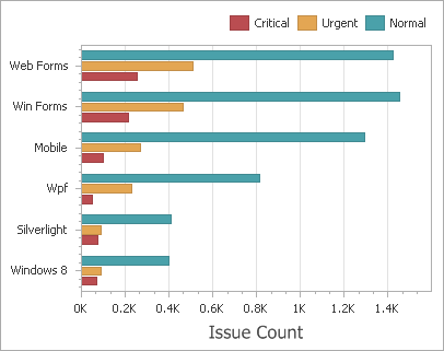
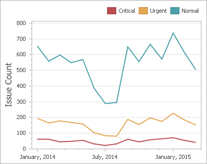
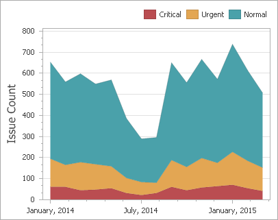
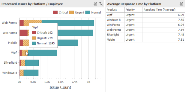
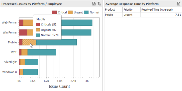
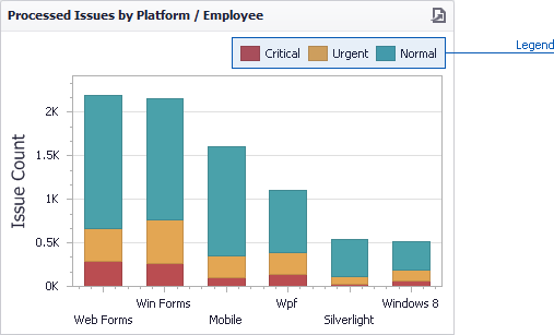
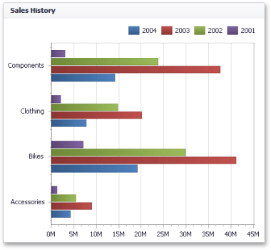
The image below shows a sample Chart dashboard item that is bound to data.
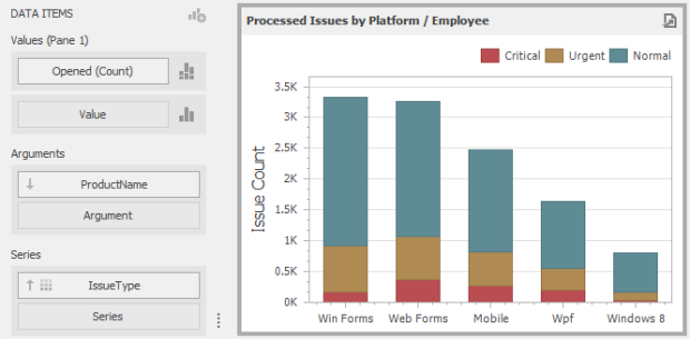
To bind the Chart dashboard item to data, drag and drop a data source field to a placeholder contained in one of the available data sections. The table below lists and describes the Chart's data sections.
|
Section |
Description |
|
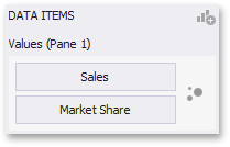
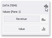
Values |
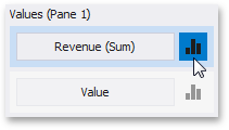
Contains Data Items against which the Y-coordinates of data points are calculated. The Options button next to the Value data item allows you to select the series type and specify different options. Note that some types of series accept several measures. To learn more, see the documentation for the required series type. |
|
Arguments |
Contains Data Items that provide values displayed along the X-axis of the chart. |
|
Series |
Contains Data Items whose values are used to create chart series. |
Transposing Arguments and Series
The Chart dashboard item provides the capability to transpose chart arguments and series. In this case, Data Items contained in the Arguments section are moved to the Series section, and vice versa.
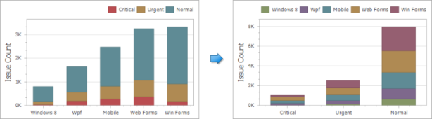
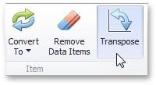
To transpose the selected Chart dashboard item, use the Transpose button in the Home ribbon tab.
Series
This section describes how to select a desired series type in the overview topic, and lists the variety of available series types.
Series Overview
The Chart dashboard item supports a variety of series types - from simple bar and line charts to complex candle stick and bubble graphs.
Series Types
To switch between series types in the Dashboard Designer, click the Options button next to the required data item (or placeholder) in the Values section. Filtering can be applied to either underlying or aggregated data.
In the invoked Series Options dialog, select the required series type and click OK.
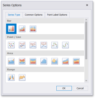
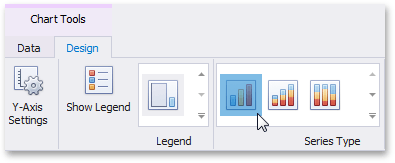
You can also do this using the Series Type gallery in the Design Ribbon tab.
Series Options
To manage common series options, use the Common Options tab of the Series Options dialog.
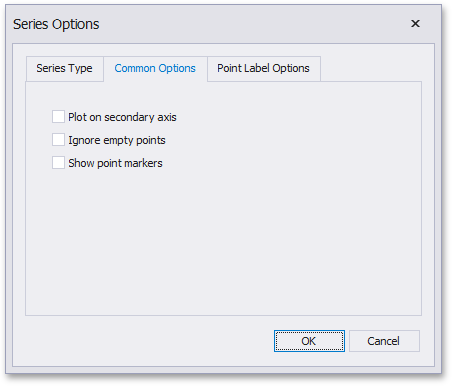
Plot on secondary axis: Specifies whether or not the secondary axis is used to plot the current series.
Ignore empty points: Specifies whether or not empty points are ignored when plotting the current series. Note that this option is in effect for the Line, Area, and Range Area series.
Show point markers: Specifies whether or not to show point markers for the current series. Note that point markers are always shown when Master Filtering is enabled for the Chart dashboard item.
Series Point Labels
The Point Label Options tab of the Series Options dialog allows you to enable series point labels and manage their settings.
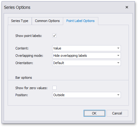
Show point labels: Specifies whether or not to show point labels for the current series.
Content: Specifies the type of content displayed within point labels.
Overlapping mode: Specifies the label overlap mode. This option is not in effect when the dashbaord is displayed in the Web Viewer.
Orientation: Specifies the orientation of point labels.
Bar options: These settings are in effect for Bar series only.
Show for zero values: Specifies whether or not to show labels for points with zero values. Position - Specifies the position of point labels relative to bars.
Bar Series
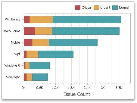
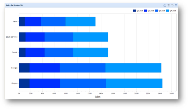
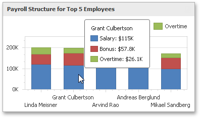
Bar series visualize data using rectangular bars with lengths proportional to the values that they represent.
Bar series can be used to compare values across categories.
Stacked Bar series show the contribution of individual categories to the whole.
Full-Stacked Bar series allow you to compare the percentage that each value contributes to a total across categories.
Point and Line Series
Point series visualize data as a set of individual numeric data points. Line series are used to connect numeric data points by different types of line segments.
The following types of Point and Line series are available:
- Point Line
- Stacked Line
- Full-Stacked Line Step Line
- Spline
Point series visualize data as a set of individual numeric data points.
Line Series Connect numeric data points by straight line segments.
Stacked Line series are useful for showing the trend of the percentage for each value.
Step Line series use vertical and horizontal lines to connect the numeric data points forming a step-like progression.
Spline series plot a fitted curve through each numeric data point.
Area Series
Area series connect numeric data points by different types of line segments and fill the area between the line and X- axis/other series.
The following types of Point and Line series are available:
-
Area
-
Stacked Area
-
Full-Stacked Area
-
Step Area
-
Spline
-
Area Stacked
-
Spline Area
-
Full-Stacked Spline Area
Area series connect numeric data points y straight line segments and fill the area between the line and X-axis.

Stacked Area series can be used to show the trend of the contribution for each value. Stacked Area series connect numeric data points by straight line segments and fill the area between the line and previous series.
Full-Stacked Area series are useful to show the trend of the percentage for each value.

Step Area series use vertical and horizontal lines to connect the numeric data points forming a step-like progression and fill the area between the line and X-axis
Spline Area series plot a fitted curve through each numeric data point and fill the area between the line and X-axis.
Stacked Area series can be used to show the trend of the contribution for each value. Stacked Area series plot a fitted curve through each numeric data point, and fill the area between the line and previous series.
Full-Stacked Spline Area series are useful to show the trend of the percentage for each value.
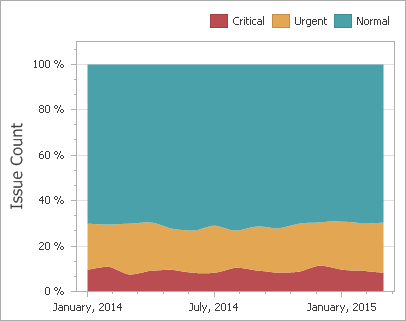
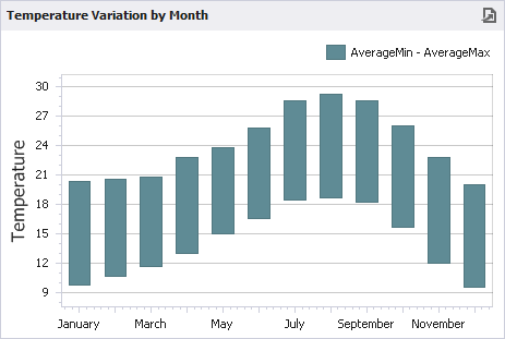
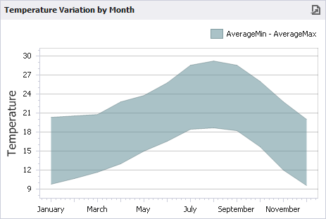
Range Series
Range series are generally used to show variations in a specified time range like temperature, price, etc. The following types of Range series are available:
-
Range Bar
-
Range Area
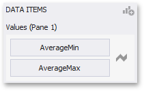
A range series is a space between two simple series displayed as a filled area (Range Area) or bars that stretch from a point in one series to the corresponding point in the other (Range Bar). Thus, you need to provide two measures instead of one to display a range series.
Value 1 - a measure against which the first set of values is calculated.
Value 2 - a measure against which the second set of values is calculated.
When you select the Range Bar or Range Area series type in the Designer, the Data Items area displays two data item placeholders. Drag and drop the required measures to corresponding placeholders.
Range Bar series are similar to Bar Series except that they are drawn between a range of values.
Range Area series are similar to Area Series except that their areas are filled between a range of values.
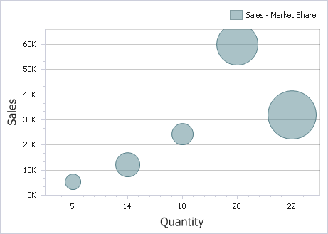
Weighted Series
Weighted series allow you to visualize data in three dimensions. The following types of Weighted series are available:
-
Bubble
Data points in a weighted series present the following two measures.
Value - the Y-coordinate of series points.
Weight - the size of series points.
When you select the Bubble series type in the Designer, the data items area displays two data item placeholders. Drag and drop the required measures to corresponding placeholders.
Bubble series are similar to Point Series except that they allow you to provide an additional measure whose values are expressed in a bubble size.
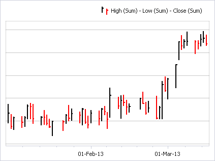
Financial Series
Financial series are used to illustrate stock prices. The following types of Financial series are available.
-
High-Low -Close Stock
-
Candle Stick
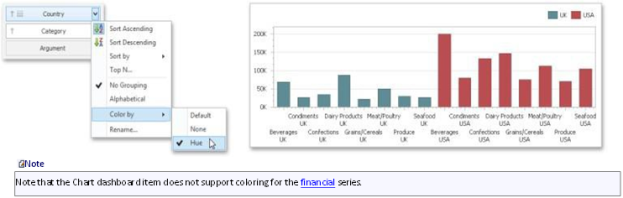
Note that financial series do not support a standard coloring mechanism used to color chart series points. The Chart dashboard item colors series points of financial series in the following way.
Black if the price at the end of the previous period is lower than the price at the end of the current period.
Red if the price at the end of the previous period is larger than the price at the end of the current period.
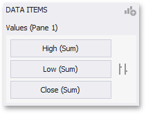
When you select the High-Low-Close series type in the Designer, the Data Items area displays three data item placeholders. High-Low-Close series require three measures to be provided.
-
High: the maximum price within the specified period (the top of the series point).
-
Low: the minimum price within the specified period (the bottom of the series point).
-
Close: the price at the end of the specified period (the tick mark).
When you select the Stock series type in the Designer, the Data Items area displays four data item placeholders. Stock series require four measures to be provided.
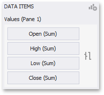
Open: the price at the beginning of the specified period (the left tick mark).
High: the maximum price within the specified period (the top of the series point).
Low : the minimum price within the specified period (the bottom of the series point).
Close: the price at the end of the specified period (the right tick mark).
When you select the Candle Stick series type in the Designer, the Data Items area displays four data item placeholders. Candle Stick series require four measures to be provided.
Open: the price at the beginning of the specified period.
High: the maximum price within the specified period (the upper shadow top).
Low : the minimum price within the specified period (the lower shadow bottom).
Close : the price at the end of the specified period.
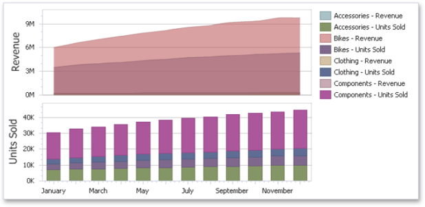
The Chart dashboard item can contain any number of panes. Panes are visual areas within a diagram that display chart series.
Each pane has its own Y-axis and displays a specific set of series. All panes in a chart share the same X-axis.
To add a pane click the Add Pane button (the  icon) at the top right of the Data Items pane.
Once a new pane is added, the Dashboard Designer creates another Values section in the Data Items pane.

Use this section to provide Data Items that supply values to be displayed in the new pane.
To remove a pane, click the Remove Pane button (the  icon) displayed in the corresponding Values section.
Interactivity
This section describes features that enable interaction between the Chart and other dashboard items. These features include Master Filtering and Drill-Down.
Master Filtering
The Dashboard allows you to use any data aware dashboard item as a filter for other dashboard items (Master Filter).
The Chart dashboard item supports filtering by argument, series or points.
Filtering by Arguments
When filtering by arguments is enabled, you can click series points to make other dashboard items only display data related to selected argument values.
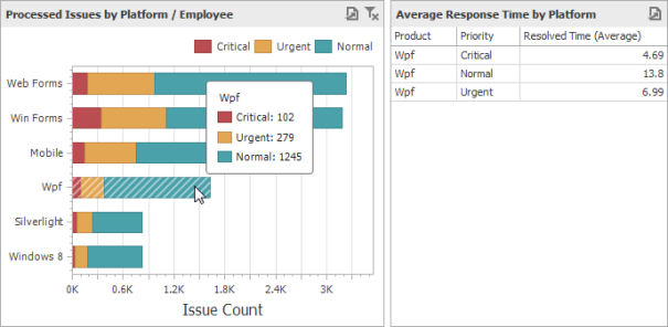
To enable filtering by arguments in the Designer, set the required Master Filter mode and click the Arguments button in the Data Ribbon tab (or the  button if you are using the toolbar menu).
Filtering by Series
When filtering by series is enabled, you can click a series point to make other dashboard items only display data related to the selected series.
To enable filtering by series in the Designer, set the required Master Filter mode and click the Series button in the Data Ribbon tab (or the  button if you are using the toolbar menu).
Filtering by Points
When filtering by points is enabled, you can click a individual point to make other dashboard items display only data related to the selected point.
To enable filtering by points in the Designer, set the required Master Filter mode and click the Points button in the Data Ribbon tab.
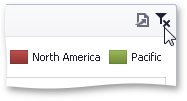
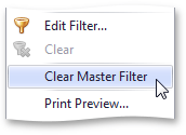
Reset Filtering
To reset filtering, use the Clear Master Filter button in the chart's caption area or the corresponding command in the chart's context menu.
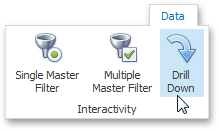
Drill-Down
The built-in drill-down capability allows you to change the detail level of data displayed in dashboard items on the fly.
The Chart dashboard item supports drill down on argument or series values.
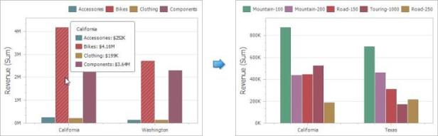
Drill-Down on an Argument
When drill down on arguments is enabled, you can click a series point to view a detail chart for the corresponding argument value.
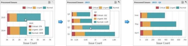
When Filtering by Arguments is enabled, you can view the details by double-clicking a series point.
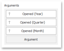
Drill down on arguments requires that the Arguments section contains several Data Items, from the least detailed to the most detailed item.
To enable drill down on arguments, click the Drill Down button in the Data Ribbon tab (or the  button if you are using the toolbar menu) and the Arguments button (or the
  button if you are using the toolbar menu).
Drill-Down on a Series
When drill down on a series is enabled, you can click a series point (or corresponding legend item) to view a detail chart for the corresponding series.
When Filtering by Series is enabled, you can view the details by double-clicking on a series point.
Drill down on a series requires that the Series section contains several Data Items, from the least detailed to the most detailed item.
To enable drill down on a series, click the Drill Down button in the Data Ribbon tab (or the button if you are using the toolbar menu) and the Series button (or the  button if you are using the toolbar menu).
Drill-Up

To return to the previous detail level (drill up), use the Drill Up button within the Chart caption or in the context menu.
Coloring
Certain dashboard items provide the capability to color dashboard item elements by associating dimension values/ measures and specified colors. You can choose whether to use a global color scheme to provide consistent colors for identical values or specify a local color scheme for each dashboard item.
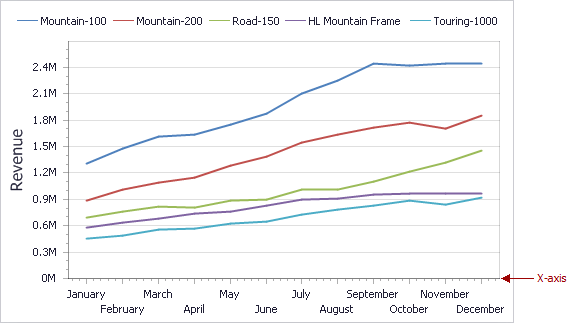
By default, the Chart dashboard item colors different measures and series dimensions by hue. In the example below, series points corresponding to different countries (UK and USA) are painted in different colors.
Legend
A legend is an element of a chart that identifies chart series and series points (for instance, colored points corresponding to argument values).
This topic describes how to customize various legend settings.
Visibility
You can specify whether or not a chart should display a legend.
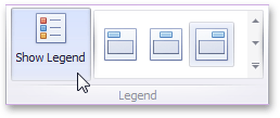
In the Designer, use the Show Legend button in the Legend section of the Design Ribbon tab.
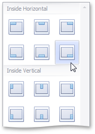
Position and Orientation
To specify the legend's position and orientation, select one of the predefined options from the gallery in the Design Ribbon tab,
Axes
The Chart dashboard item displays two axes by default: the X-axis and the Y-axis. The topics in this section describe how to customize axis settings.
X-Axis
The X-axis is the axis of arguments.
General X-Axis Settings
To access X-axis settings, use the X-Axis Settings button in the Diagram section of the Design Ribbon tab.
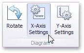
This will invoke the X-Axis Settings dialog.
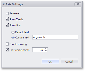
This dialog contains the following settings:
|
Reverse |
Allows you to reverse the X-axis. If the X-axis is reversed, its values are ordered from right to left. |
|
Show X-axis |
Allows you to hide and show the X-axis. |
|
Show title |
Allows you to hide and show the X-axis title. You can choose whether to use the default text or specify a custom string. |
|
Enable zooming |
Allows you to enable zooming for the X-axis. The X- axis' scroll bar provides the capability to perform navigation in the zoomed diagram. |
|
Limit visible points |
Allows you to limit the number of points displayed on the chart's diagram along the X-axis. The X-axis' scroll bar provides the capability to perform navigation if the number of all points exceeds the number of visible points. |
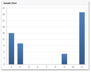
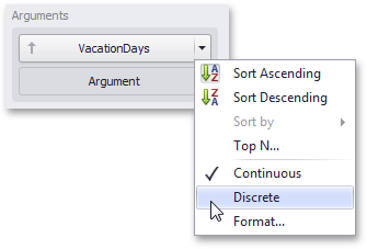
Continuous and Discrete X-Axes
If the dimension in the Arguments section contains numeric data, the Chart can create either a continuous X-axis or a discrete X-axis.
|
Continuous X-axis |
Discrete X-axis |
|
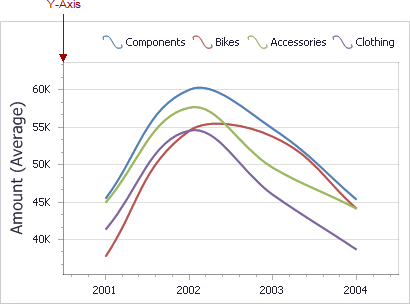
If a continuous axis is used, the distance between argument values is proportional to their values. |
On a discrete axis, all argument values are an equal distance from each other. |
|
|
|
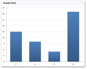
To specify the X-axis type in the Designer, invoke the data item menu for the argument dimension and select the axis type.
Y-Axis
The Y-axis is the numerical axis of values.
General Settings
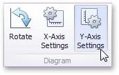
To access the Y-axis settings, use the Y-Axis Settings button in the Diagram section of the Design Ribbon tab.
This will invoke the Y-Axis Settings dialog.
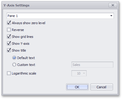
Use the combo box at the top to select the pane for the Y-axis settings you need to edit. The dialog contains the following settings:
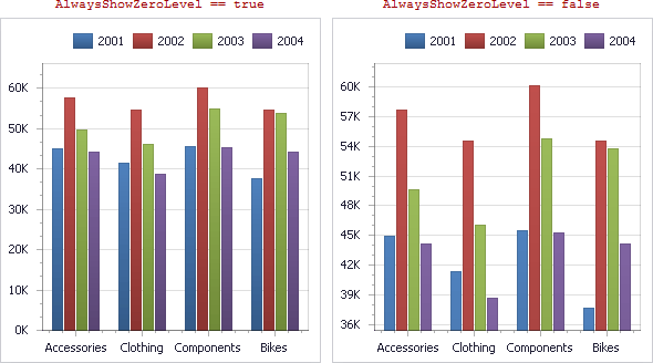
Always show zero level: Specifies whether or not the axis' zero level is visible. If this option is unchecked, the visible axis range is defined based on the values plotted in the chart.
Reverse: Allows you to reverse the X-axis. If the X-axis is reversed, its values are ordered from top to down.
Show grid lines: Allows you to hide and show grid lines for the Y-axis.
Show Y-axis: Allows you to hide and show the Y-axis.
Show title: Allows you to hide and show the Y-axis title. You can choose whether to use the default text or specify a custom string.
Orientation
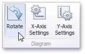
You can rotate the Chart so that the X-axis becomes vertical, and the Y-axis becomes horizontal.

To rotate a Chart in the Designer, use the Rotate button in the Diagram group of the Design Ribbon tab.