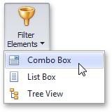
Filter Elements
Filter elements represent a special type of dashboard item that allows you to apply filtering to other dashboard items.
Filter Elements Overview
The Dashboard Designer allows you to create three types of filter elements that provide the capability to filter other dashboard items.
To add the required filter element to the dashboard, use the Filter Elements button in the Home ribbon tab.
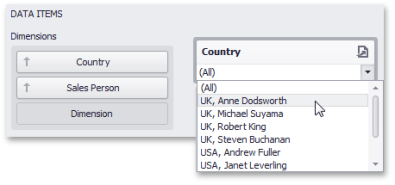
Combo Box
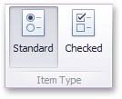
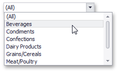
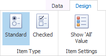
The Combo Box dashboard item allows you to select a value(s) from the drop-down list. You can switch the combo box type in the ribbon Design tab.
| Combo Box Type |
Example |
Description |
|
Standard |
|
Allows you to select only a single value. |
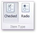
| Checked |
|
Allows you to select multiple values in the invoked drop-down list. |
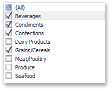
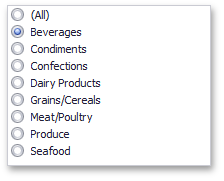
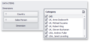
List Box
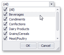
The List Box dashboard item allows you to select a value(s) from the list. You can switch the list box type in the ribbon Design tab.
| List Box Type | Example | Description |
|
Checked |
|
Allows you to select multiple values in the list box. |
|
Radio |
|
Allows you to select only a single value in the radio group. |
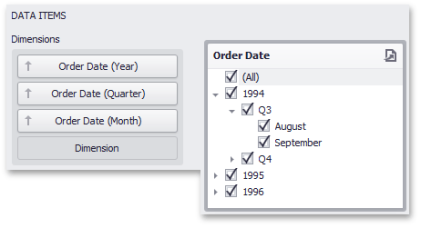
Tree View
The Tree View dashboard item displays values in a hierarchical way and allows you to expand/collapse nodes.
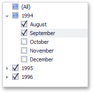
You can manage the initial expanded state of filter values using the Auto Expand button in the Design ribbon tab.

Providing Data
This topic describes how to bind filter elements to data using the Dashboard Designer.
The Dashboard Designer allows you to bind various dashboard items to data in a consistent manner, the only difference being the data sections that these dashboard items comprise.
Binding Overview
All filter elements provide the Dimensions data section, which accepts dimensions used to provide filter values. To learn about the specifics of binding various filter elements to data, see the table below.
| Dashboard Item | Data Sections |
Description |
|
Combo Box |
|
The Combo Box filter element can contain several dimensions at the Dimensions data section. In this case, the drop- down list will contain combinations of dimension values. |
|
List Box |
|
The List Box filter element can contain several dimensions at the Dimensions data section. In this case, the list will contain combinations of dimension values. |
| Tree View |
|
The Tree View filter element allows you to display dimension values in a hierarchical way. This can be the set of dimensions with different group intervals (for instance, Year/ Quarter/ Month) or the set of related dimensions (for instance, geographical data such as continents/ countries/ cities). |
Interactivity
This document describes the filtering capabilities supported by filter elements. You can use filter elements to apply master filtering to other dashboard items or introduce hierarchical filtering by adding several connected filters.
Master Filtering
The Dashboard allows you to use any data aware dashboard item as a filter for other dashboard items (Master Filter).
Note that filter elements do not support Master Filter selection modes. You can switch the selection mode by changing the type of the required filter element.
Depending on the filter element type, you can select a value(s) to make other dashboard items display only data related to the selected value(s).
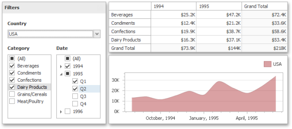
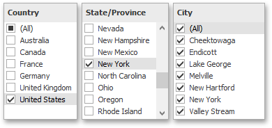
You can also create a set of related filter elements containing relevant filter values. For instance, in the image below, the State/Province filter element contains states related to the 'United States' value, while the City filter element contains cities related to the 'New York' value.
Disable the Ignore Master Filters option for the required filter element to allow applying filtering to this element.
Filter Element Options
Filter elements provide the capability to specify whether to enable the (All) option that allows you to apply filtering by all values. To do this, use the Show 'All' Value button in the Design ribbon tab.
NOTE: This capability is supported by the 'Standard' Combo Box and 'Radio' List Box filter elements.