Grid
The topics in this section describe the features available in the Grid dashboard item, and provide extensive information on how to create and customize grids in the Dashboard Designer.

Providing Data
The Dashboard Designer allows you to bind various dashboard items to data in a virtually uniform manner.
The only difference is in the data sections that the required dashboard item has. This topic describes how to bind a Grid dashboard item to data in the Designer.
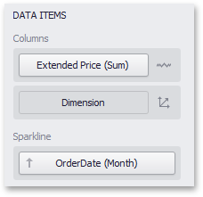
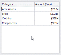
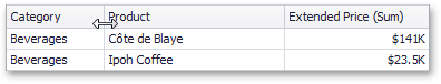
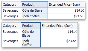
The image below shows a sample Grid dashboard item that is bound to data.
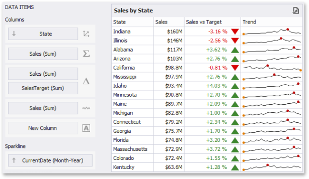
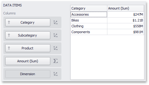
To bind the Grid dashboard item to data, drag and drop a data source field to a placeholder contained in one of the available data sections. A table below lists and describes a Grid's data sections.
| Section | Description |
|---|---|
|
Columns |
Contains Data Items that provide values for grid columns. The Option s button next to the Column data item allows you to select the column type and specify their options. |
|
Sparkline |
Contains a data item that provides arguments for sparkline columns. To learn more, see Sparkline Column. |
The Grid displays data in a two-dimensional table that supports four types of columns.
-
The dimension column displays values from the bound data item "as is".
-
The measure column displays summaries calculated from data in the bound data item.
-
The delta column, bound to two measures, calculates summaries for both measures, and displays the difference between these summaries.
-
The sparkline column visualizes the variation of summary values over time.
To sort records by a column's values and replace existing sort conditions that are applied to the current or other columns, click the target column's header until an Up or Dow n arrow icon is displayed within the header. The Up and Dow n arrows indicate ascending and descending sort orders, respectively.
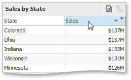
To sort records by a column's values while preserving existing sort conditions, click a column header while holding the Shift key until an Up or Down arrow icon is displayed within the header.
To remove sorting by a column, click a column header while holding down the CTRL key.
To filter grid data, click the filter button (the icon) and select the required filter value in the invoked filter drop-down list.
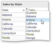
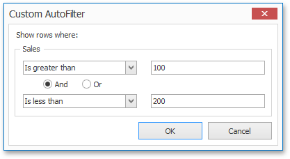
Click Custom to construct filter criteria involving up to two conditions. This will invoke the Custom AutoFilter dialog, allowing you to compare a column with one or two values.
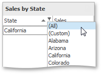
To clear the filter applied to a specific column, invoke the filter drop-down list and click All.
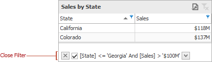
To clear all filter criteria, click the Close Filter button within the Filter Panel.
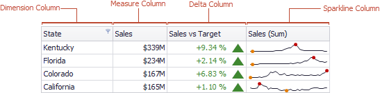
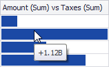
A Grid dashboard item can display a tooltip when the mouse pointer is hovered over the bar in the measure column.
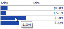
The tooltip shows the value in the measure column as text.
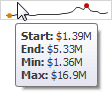
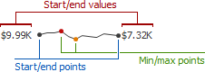
When the mouse pointer is hovered over the cell in the sparkline column, the tooltip can display start/end values and minimum/maximum values.
Columns
The topics in this section describe the different types of grid columns, and contain information on when to use each column type and how to customize them based on the type.
Column Type Overview
The Grid dashboard item supports four types of columns:
-
Dimension Column: Displays values in the bound data item "as is".
-
Measure Column: Displays summaries calculated against data in the bound data item.
-
Delta Column: Bound to two measures, it calculates summaries for both measures, and displays the difference between these summaries.
-
Sparkline Column: Displays values in the bound data item using sparklines.
When you drop a data item into the Columns section, the type for the new column is determined automatically, based on the data type.
Column Type Indication
The type of the column is indicated within the corresponding data item container in the Data Items area.
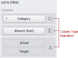
Column type indicators are defined as follows:
|
|
|
|
|
|
|
|
|
|
|


Changing Column Type
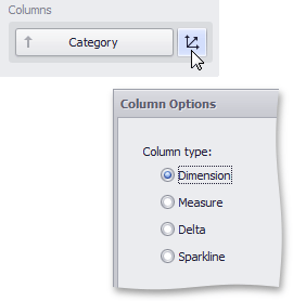
To change the column type, click the column type indicator. In the invoked Column Options window, select the required column type in the Column type section.
Dimension Column
The dimension column displays values from the bound data item "as is".
If the dimension column is bound to a data source containing images, it can display images.
Measure Column
A measure column displays summaries calculated against data in a bound data item.
Values in the measure column can be displayed as text or represented by bars.

To select between these modes, invoke the Column Options window and select Value or Bar.
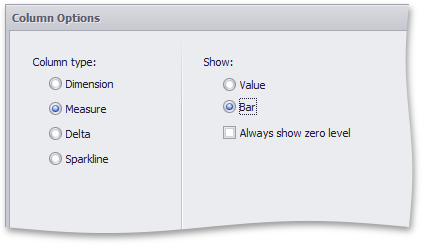
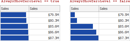
If bars are displayed, use the Always show zero level check box to specify whether the bar's zero level is always visible.
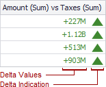
Delta Column
A delta column calculates summaries against two measures, and displays the difference between these summaries. This difference can be indicated with a numeric value displayed within the delta element and an additional delta indication.
Data Binding Specifics
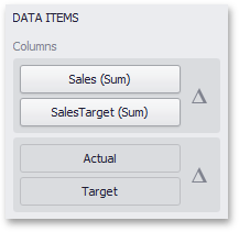
Delta columns are bound to two measures that provide two values: the Actual value and the Target value. The difference between these values is displayed in the column.
When you switch the column type to Delta, the data item container is changed, to accept the Actual and Target measures.
Display Mode
Values in the delta column can be displayed as text, or represented by bars.
To select between these modes, invoke the Column Options window and select Value or Bar.
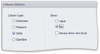
If bars are displayed, use the Always show zero level check box to specify whether the bar's minimum value is zero (checked) or an automatically selected value that ensures that the difference between bars is clearly displayed (unchecked).
Delta Values and Indication
If the display type is set to Value, the Column Options window displays options that allow you to configure delta values and indication.
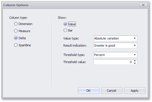
You can specify which values should be displayed in the delta column. To do this, use the Value type combo box in the Column Options window.
|
Actual Value |
Absolute Variation |
Percent Variation |
Percent of Target |
|
|
|
|
|


To specify the condition for displaying delta indication, use the Result indication combo box in the Column Options window.
|
Greater is Good |
Less is Good |
Warning if Greater |
Warning if Less |
No Indication |
|
|
|
|
|
|


Comparison Tolerance
The comparison tolerance allows you to specify more advanced conditions for displaying delta indication. For instance, you can set a specific indication to be displayed when the actual value exceeds the target value by 10% or by $2K.
Use the Threshold type combo box to select whether you wish to specify the comparison tolerance in percentage values or in absolute values. Then use the Threshold value box to specify the comparison tolerance.
Sparkline Column
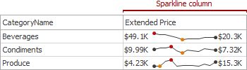
A sparkline column visualizes the variation in summary values over time.
Data Binding Specifics
The sparkline column is bound to a measure providing sparkline values and to a dimension providing a date-time interval.
Sparkline Options
You can control sparkline appearance settings using the Column Options dialog. To invoke this dialog, click the column type indicator ( ).
).
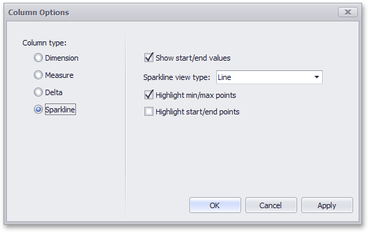
In this dialog, you can control various settings that affect how the sparkline is displayed within a grid cell.
| Sparkline Options | Description |
|---|---|
|
Show start/end values |
Species whether or not to display sparkline start/end values within a grid cell. |
|
Sparkline view type |
Defines the view type of a sparkline. Sparkline view types include Line, Area, Bar, and Win/Loss. |
|
Highlight min/max points |
Specifies whether or not to highlight the minimum/ maximum points of a sparkline. |
|
Highlight start/end points |
Specifies whether or not to highlight the start/end points of a sparkline. |
Interactivity
This section describes features that enable interaction between the Grid and other dashboard items. These features include Master Filtering and Drill-Down.
Master Filtering
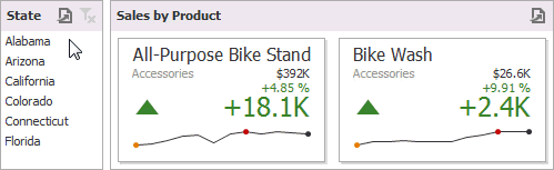
The Dashboard allows you to use any data aware dashboard item as a filter for other dashboard items (Master Filter).
Configure Master Filters in the Designer
The Grid dashboard item supports filtering by rows.
When Master Filtering is enabled, you can click a grid row (or multiple rows by holding down the CTRL key) to make other dashboard items only display data related to the selected record(s).
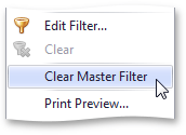
To reset filtering, use the Clear Master Filter button (the  icon) in the grid's caption area, or the Clear Master Filter command in the grid's context menu.
Drill-Down
The built-in drill-down capability allows you to change the detail level of data displayed in dashboard items on the fly.
The Grid dashboard item supports drill-down for rows.
When drill-down is enabled, you can click a grid row to view the details.
When Master Filtering is enabled, you can view the details by double-clicking a grid row.
Drill-down requires that the Columns section contains several dimensions at the top, from the least detailed to the most detailed dimension.
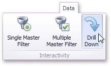
To enable drill-down, click the Drill Down button in the Data Ribbon tab (or the  button if you are using the toolbar menu).
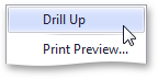
To return to the previous detail level (drill up), use the Drill Up button (the  icon) within the grid's caption area, or the Drill Up command in the grid's context menu.
Conditional Formatting
The Grid dashboard item supports the conditional formatting feature that provides the capability to apply formatting to grid cells whose values meet the specified condition. This feature allows you to highlight specific cells or entire rows using a predefined set of rules.
Conditional Formatting Overview
The Grid dashboard item allows you to apply conditional formatting to Data Items providing data to the following column types:
-
Dimension column
-
Measure Column
-
Sparkline Column
NOTE: You can use hidden measures to specify a condition used to apply formatting to visible values. New appearance settings are applied to grid cells corresponding to the target dimension/measure values.
Create a Formal Rule
To create a new format rule for the grid's dimension/measure, do one of the following:
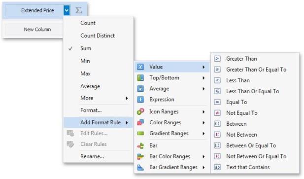
Click the Options button next to the required measure/dimension, select Add Format Rule and choose the condition.
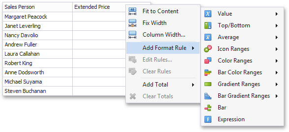
Right-click the column header corresponding to the required measure/dimension and select Add Format Rule.
Depending on the selected format condition, the dialog used to create a format rule for Grid contains different settings. For instance, the image below displays the Greater Than dialog corresponding to the Value format condition.
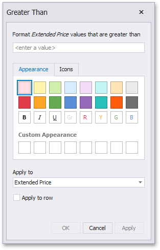
The Apply to row check box allows you to specify whether to apply the formatting to the entire grid row.
Edit a Format Rule
To edit format rules for the current Grid dashboard item, use the following options:
-
Click the Edit Rules button in the Home ribbon tab or use corresponding item in the Grid context menu.
-
Click the menu button for the required data item and select Edit Rules. As an alternative, right-click the column header corresponding to the required data item and select Edit Rules.
All of these actions invoke the Edit Rules dialog containing existing format rules.
Totals
The Grid dashboard item enables you to add a summary value (a total) calculated against displayed values of an individual column, and show the result under this column. Note that you can add any number of totals for each column. For example, you can obtain the number of column records, average or maximum value, etc.
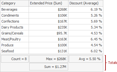
Totals Overview
You can use the following summary functions when creating totals:
-
Count: The number of records
-
Sum: The sum of the values

-
Min: The smallest value
-
Max: The largest value
-
Average: The average of the values

-
Auto: The total is calculated using the type of summary function specified for the measure corresponding to the current Grid column. Note that in this case, the total is calculated based on values of the corresponding data field from the underlying data source.
You can create totals using different sets of summary functions. This depends on the type of the data source field providing data for the target column.
| Icon | Data Source Field Type | Supported Totals |
|---|---|---|
|
|
Boolean |
Count |
|
|
Byte |
Count |
|
|
Date-time |
Min,Max,Count |
|
|
Numeric |
Allavailabletypes |
|
|
String |
Min,Max,Count |


Note that the Auto type is available only for the Measure column.
Create and Edit Tools
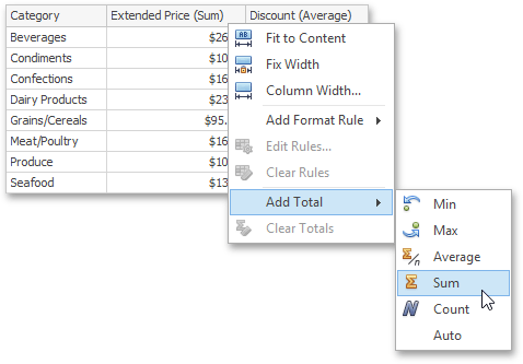
To create a total, use the context menu of the column header. Right-click the required column header, select Add Total and specify the type of summary function used to calculate a total.
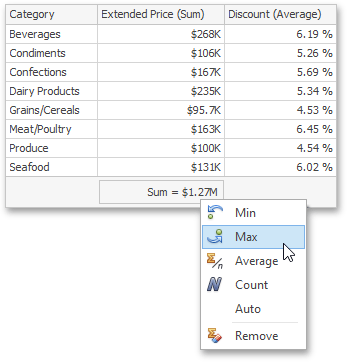
To change the total type, right-click the required total and select a new total type.
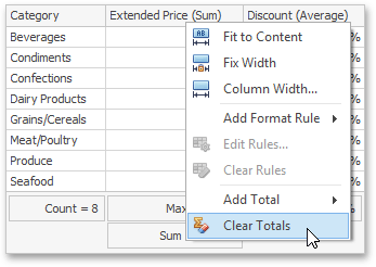
Clear Totals
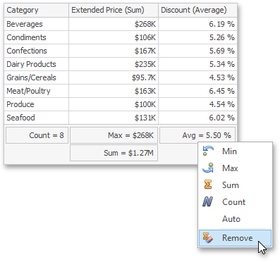
You can delete one total or all the totals in a particular column.
To delete a single total, right-click a total and select Remove.
To delete all column totals, right-click the column header and select Clear Totals in the invoked context menu.
Layout
The Grid dashboard item allows you to customize its layout in various ways. You can manage the width of grid columns, specify the visibility of column headers, enable cell merging, etc.
To do this, use the Layout and Column Width Mode groups in the Design Ribbon tab.
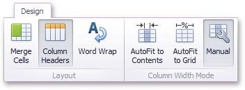
The Grid dashboard item allows you to manage column widths using different modes. Use buttons in the Column Width Mode group to manage the column width modes.
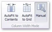
The following modes are available:
-
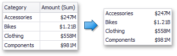
AutoFit to Contents: The grid adjusts columns to the minimum width required to completely display their content automatically. If the entire content cannot be displayed within the dashboard item, horizontal scrolling is enabled.
-
AutoFit to Grid: The grid adjusts the width of all columns to fit their content in an optimal way. If you are changing the size of the dashboard item, the width of columns is changed proportionally..
-
Manual: The grid allows you to adjust column widths manually.
In this mode, you can adjust the width of individual columns in the following ways:
Specify the width of the required column by dragging the right edge of the column header
In this case, all columns preserve their relative size when the grid width is changed.
Specify the column width and fix it by right-clicking the required column header and selecting Fix Width.
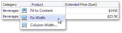
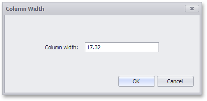
You can also specify the fixed column width by selecting Column Width. This invokes the Column Width window that allows you to specify the width of the column in characters.
Fit the column width to its content and fix it by right-clicking the required column header and selecting Fit to Content.
Column Header
Use the Column Headers button to toggle column header visibility.
Cell Merging
The Grid allows you to merge neighboring cells with identical values . To do this, use the Merge Cells button.
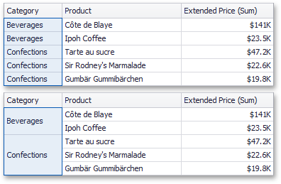
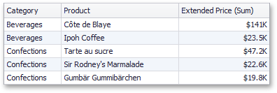
Note that the banded rows are not available when cell merging is enabled.
Word Wrapping
The word wrapping feature enables the capability to display cell content on multiple lines if the size of a dashboard item is insufficient to completely display the cell content on a single line.
The word wrapping feature is not in effect when the AutoFit to Contents column width mode is enabled.
Style
The Grid dashboard item allows you to specify various style settings. To do this, use the Style group in the Design Ribbon tab.
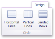
Grid Lines
The Horizontal Lines and Vertical Lines buttons control grid line visibility
Banded Rows
To paint the background of odd and even rows differently, use the Banded Rows button.
Banded rows are not available when cell merging is enabled.