Pies
The Pie dashboard item displays a series of pies or donuts that represent the contribution of each value to a total.
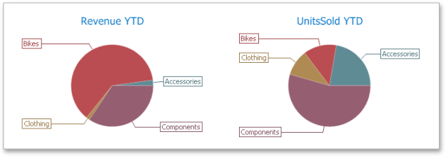
The Pie dashboard item displays a series of pies or donuts that represent the contribution of each value to a total.
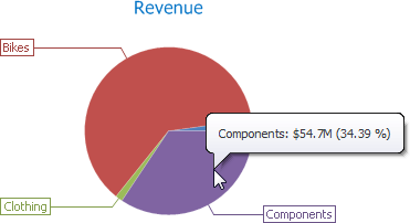
A Pie dashboard item can display a tooltip that shows information about the hovered pie segment.
Providing Data
The Dashboard Designer allows you to bind various dashboard items to data in a virtually uniform manner.
The only difference is in the data sections that the required dashboard item has. This topic describes how to bind a Pie dashboard item to data in the Designer.
Binding to the Data in the Designer
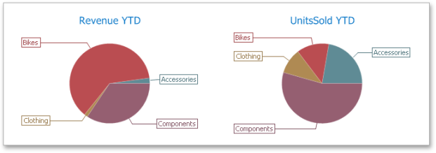
The image below shows a sample Pie dashboard item that is bound to data,
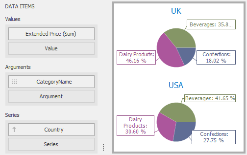
To bind the Pie dashboard item to data, drag and drop a data source field to a placeholder contained in one of the available data sections. A table below lists and describes Pie's data sections.
| Section | Description |
|---|---|
|
Values |
Contains Data Items that define the share of pie segments. In case of negative measure values, Pie uses their absolute values. |
|
Arguments |
Contains Data Items that provide values used to label pie segments. |
|
Series |
Contains Data Items whose values are used to label pie charts. |
Transposing Arguments and Series
The Pie dashboard item provides the capability to transpose pie arguments and series. In this case, Data Items contained in the Arguments section are moved to the Series section, and vice versa.
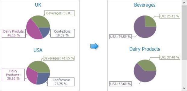
To transpose the selected Pie dashboard item, use the Transpose button in the Home ribbon tab.
Interactivity
This section describes features that enable interaction between the Pie dashboard item and other items. These features include Master Filtering and Drill-Down.
Master Filtering
The Dashboard allows you to use any data aware dashboard item as a filter for other dashboard items (Master Filter).
The Pie dashboard item supports filtering by argument or series values.
Filtering by Arguments
When filtering by arguments is enabled, you can click a pie segment to make other dashboard items only display data related to the selected argument value.
To enable filtering by arguments in the Designer, set the required Master Filter mode and click the Arguments button in the Data Ribbon tab (or the  button if you are using the toolbar menu).
Filtering by the Series
When filtering by series is enabled, you can click a pie to make other dashboard items display only data related to the selected pie.
To enable filtering by series in the Designer, set the required Master Filter mode and click the Series button in the Data Ribbon tab (or the  button if you are using the toolbar menu).


Filtering by Points
When filtering by points is enabled, you can click a single pie segment to make other dashboard items display only data related to the selected segment.

To enable filtering by points in the Designer, set the required Master Filter mode and click the Points button in the Data Ribbon tab.
Reset Filtering
To reset filtering, use the Clear Master Filter button (the  icon) in the caption area of the Pie dashboard item, or the Clear Master Filter command in the Pie's context menu.
Drill-Down
The built-in drill-down capability allows you to change the detail level of data displayed in dashboard items on the fly.
The Pie dashboard item supports drill-down on argument or series values.
Drill-Down on an Argument
When drill down on an argument is enabled, you can click a pie segment to view a detail diagram for the corresponding argument value.

When Filtering by Arguments is enabled, you can view the details by double-clicking a pie segment.
Drill down on an argument requires that the Arguments section contains several Data Items, from the least detailed to the most detailed item.
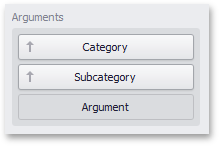
To enable drill down on an argument, click the Drill Down button in the Data Ribbon tab (or the  button if you are using the toolbar menu) and the Arguments button (or the
  button if you are using the toolbar menu).

Drill-Down on a Series
When drill down on a series is enabled, you can click a pie chart to view a detail diagram for the corresponding series value.
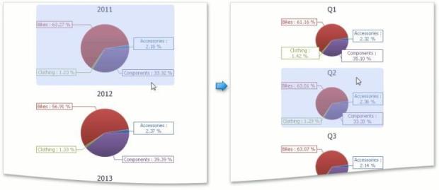
When Filtering by Series is enabled, you can view the details by double-clicking a pie chart.
Drill down on a series requires that the Series section contains several Data Items, from the least detailed to the most detailed item.
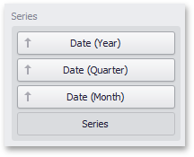
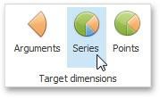
To enable drill down on a series, click the Drill Down button in the Data Ribbon tab (or the  button if you are using the toolbar menu) and the Series button (or the
  button if you are using the toolbar menu).

Drill Up
To return to the previous detail level (drill up), use the Drill Up button (the  icon) in the caption area of the Pie dashboard item, or the Drill Up command in the context menu.
Coloring
Certain dashboard items provide the capability to color dashboard item elements by associating dimension values/ measures and specified colors. You can choose whether to use a global color scheme to provide consistent colors for identical values or specify a local color scheme for each dashboard item.
By default, the Pie dashboard item colors its segments in the following ways:
-
If the Pie dashboard item contains measures (the Values section) and series dimensions (the Series section), only values corresponding to different measures are colored by hue.
-
If the Pie dashboard item contains arguments (the Arguments section), different argument values are colored by hue.
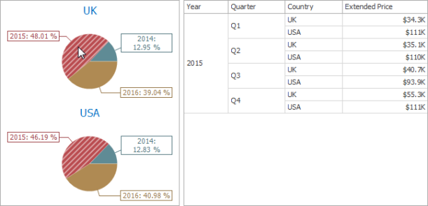
If necessary, you can change the default behavior. For instance, the image below shows the Pie dashboard item whose measures and argument values are colored by hue.

Layout
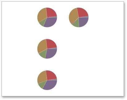
The Pie dashboard item allows you to specify the number of columns or rows in which individual diagrams are arranged.
To control how pies are arranged, use the buttons in the Content Arrangement group of the Design Ribbon tab. By default, the Auto Arrange option is enabled, which automatically resizes pies to fit within the dashboard item.
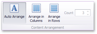
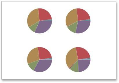
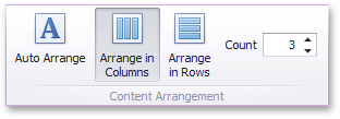
You can also specify the number of columns in which pies are arranged. Click the Arrange in Columns button and specify the appropriate number in the Count field.
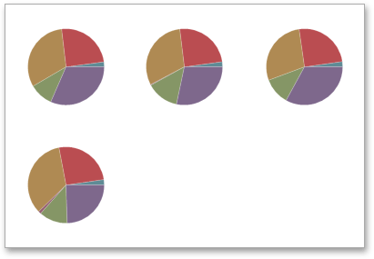
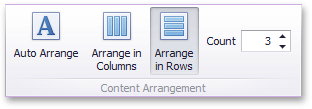
Similarly, you can arrange pies in a specific number of rows.
Labels
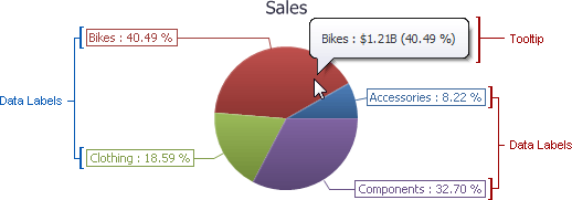
You can specify which information should be displayed within data labels and tooltips. To do this, use the Data Labels and Tooltips buttons in the Labels group of the Design Ribbon tab.
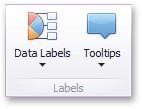
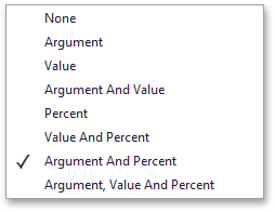
These buttons invoke a drop-down menu that is similar for both buttons. This menu allows you to specify which values are displayed within data labels or tooltips.
Style
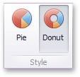
The Pie dashboard item allows you to select whether diagrams should be painted as pies or donuts.

To select the diagram style, use the Pie and Donut buttons in the Style section of the Design Ribbon tab.
