This displays a button on a dashboard. Buttons can be used to initiate a variety of functions including business rules, dashboards, and file uploads.
Image
Image File Source Type
The image displayed on the button. You can choose from the following options:
-
Url: The image displayed on the button is based on a URL.
-
Workspace File: The image displayed on the button is in a file stored in the Workspace Maintenance Unit File section.
-
Application Database File: The image displayed on the button is in a file in the Application Database Share.
-
System Database File: The image displayed on the button is in a file in the System Database Share.
-
File Share File: The image displayed on the button is in the File Share.
Image Url Or Full Name File
The URL, file path, or file name for the displayed image. Review the following syntax examples:
-
Built-in OneStream Image: /OneStream.ClientImages;component/Misc/ToolbarImage.png.
-
Web Server: http://www.onestreamsoftware.com/img/onestream-logo.png.
-
Database File System: Enter the path and file name Documents/Public/TestImage.png.
-
Workspace File: Enter the name of the file resource TestImage.png.
The following Excel properties are used to specify an Excel file from either an Extensible Document or Report Book i to display it as an image or button.
Excel Page Number
Enter the page number of the Excel document to display.
Excel Sheet
Enter the name of the Excel worksheet to display.
Excel Named Range
Enter the named range from Excel to display. The named range must be in the specified Excel sheet in the Excel Sheet property, or the Excel Sheet property must be blank to use a named range. See Component Display Format Properties to position and align the Excel image as needed.
Button
Button Type
Specify the functionality assigned to the selected button. You can choose from the following options:
-
Standard: Displays a generic button that can have custom functionality assigned, such as display a dashboard or execute a business rule.
-
File Explorer: This sets the button to display the File Explorer dialog box.
-
File Upload: This sets the button to display the File Upload dialog box.
-
Select Member: This sets the button to display the Select Member dialog box. This selection displays these Select Member properties:
-
Dimension Type: Specify the dimension type. This is required.
-
Use All Dimension for Dimension Type: When True, it overrides the Cube Restriction and displays all dimension types. When False, the dimensions are limited to defined dimension type.
NOTE: If no dimension type is defined, the selections revert to the default dimension type.
-
Dimension: Specify a specific dimension. This is optional.
Example: HoustonSalesRegionalBudget.
-
Cube: Specify a cube. This is optional.
-
Member Filter: Specify a Member Filter. This is optional.
Example: U3#Root.TreeDescendantInclusive.
-
-
Member Filter Builder: This sets the button to display the Member Filter Builder dialog box. This selection displays this Member Filter Builder property.
-
Default Member Filter: Specify default member filter to display upon opening. This is optional.
Example: E#[Total Golfstream].
-
-
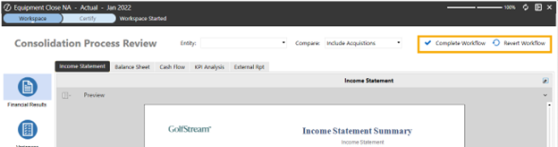
Workflow: This sets the button for Complete and Revert Workflow, replacing the need for a custom business rule. This selection displays these Workflow properties:
-
Workflow Button Action Type: Complete Workflow enables the complete action button. Revert Workflow enables the revert action button.
-
Workflow Button Image Type: Choose one of the standard button images. Use Button Image enables you to use a custom image set up in the Image properties.
-
Action
This section contains Action properties specific to the button component. For a full description of all Action properties, see Component Formatting and Action Properties.
Parameter Value for Button Click
The value or string to pass into the Bound Parameter.
Save Action
Selection Changed Save Action
What occurs when the button is pressed. The following options are specific to the button component:
-
Save Data for Components and Save Files: This will save the components modified by the Dashboard components specified in the Selection Changed Save Arguments property and their files.
-
Prompt to Save Data for Components and Save Files: This will ask the user if the modified data should be saved or not for the defined list of Dashboard components and their files.
-
Save Data for All Components and Save Files: This will save all components modified by the Dashboard components included in the Dashboard and their files.
-
Prompt to Save Data for All Components and Save Files: This will ask the user of the modified data should be saved or not for all dashboard components and their files.
-
Save All Files: This will save all modified file data within the dashboard and exclude saving any modified component data.
NOTE: The Selection Changed Save Argument field is only active when you choose a Selection Changed Save Action that requires you to specify components.

You can use these Save Files properties to save edits made in Text Editor and Spreadsheet Component files through a dashboard button. For example, the user has a dashboard containing a spreadsheet and button component, and the developer sets the button component's Selection Changed Save Action property to one of the Save Files options. When the user edits the file data in the spreadsheet component's file and then clicks the dashboard button, all file changes are saved. The dashboard component changes will also be saved. Component changes are only not saved if the Save All Files property is selected, which only saves modified file data. Users can utilize these Save Files properties through button components instead of having to navigate to File > Save in the component's toolbar to save file changes.
Considerations
-
Since Text Editor components cannot have nested components, the Save Data For Components And Save files, Save Data For All Components And Save Files, and Save All Files options will only save the Text Editor component's file.
-
When working in a spreadsheet component embedded in a dashboard, the Save Files properties enable users to save nested components while also saving the spreadsheet file. When the dashboard button is set to Save All files, only spreadsheet file modifications are saved.
This Use Case demonstrates the following situation:
-
Scenario: A user is in the Narrative Reporting solution, which utilizes a dashboard Text Editor component that displays the content of a specific file. A developer wants to give users the ability to save their file edits using the Check In button.
-
Role: Developer
-
Benefits: The developer can streamline the save process for users in Narrative Reporting by reducing the possibility of users checking in files without saving. The developer also wants to do this so that users do not have to navigate to the Text Editor's File > Save toolbar button before clicking Check In.
See Save Action Use Case for more information.
Save As
If the Text Editor or Spreadsheet components are not linked to or displaying an existing file, clicking a button component with the Save File options opens the Save New File Options window. This enables users to save a new file in different locations and performs the same function as the components' File > Save As toolbar button action.
NOTE: If you have already used the button component to Save As and created a new file, when you select the same button component again, the updates made in the dashboard component will save to that initially created file. It will not prompt the Save New File Options window to create a second new file until the user refreshes or reloads the dashboard.

Local Folder
Select location on local computer/network to save a file to.
NOTE: The Save As File on Local Folder option is not available in the Modern Browser Experience.
OneStream File System
Select location within OneStream File Explorer to save a file to.
Application Workspace File
Select Application Workspace location to save a file to.
System Dashboard File
Select System Workspace location to save a file to.


