This displays data from a Data Adapter in a grid. Similar to the SQL Table Editor, but data is not editable.
NOTE: The Grid View component should not be used for large data set, because it is not a component that uses paging. In this instance, a SQL Table Editor component should be used to display the data to the end user, and it will use paging to return the full data set.
Formatting and Action
See Component Formatting and Action Properties.
Grid View
Table Name
The name of the table created in the data Parameter.
Show Header
When set to True, the grid Name and Description will display as the Component’s header on the Dashboard. When set to False, the header is hidden.
Show Column Settings Button
When set to True, Column Settings  will show on the dashboard. When set to False, the button is hidden. The button enables users to reorder and set column visibility.
Allow Column Reorder
When set to True, you can drag columns and put them in a different order. When set to False, you cannot reorder columns.
Show Toggle Size Button
Select True to enable the toggle button and let users toggle the size of the Component at run-time. Select False to hide the toggle button.
Show Group Panel
When set to True, the column grouping option will be shown on the dashboard. Active users can drag and drop column headers to a group area to apply grouping on the data in the grid. When set to False, it is hidden.
Show Row Headers
When set to True, the grid row headers will be shown on the dashboard. When set to False, it is hidden.
Show Column Headers
When set to True, the grid column headers will be shown on the dashboard. When set to False, it is hidden.
Show Horizontal Grid Lines
When set to True, the horizontal grid lines will be shown on the dashboard. When set to False, it is hidden.
Show Vertical Grid Lines
When set to True, the vertical grid lines will be shown on the dashboard. When set to False, it is hidden.
Default for Columns are Visible
If set to True, all columns will be hidden unless overridden on an individual column.
Retain Table Column Order
When this setting is True, the column order can be changed through the Grid View Column Format section.
Column Name for Bound Parameter
Specify the name of the database column to be used to change the value of the Bound Parameter when a database row is selected. This is used when a SQL Table Editor is being used to affect the display of other components, for example when showing detailed information for the selected row.
Allow Multiselect
Multiselect will generate the Bound Parameter as a comma-delimited list. Use one of the following selection methods to multiselect:
-
Select all rows with the Select All checkbox.
-
Select multiple rows using the Shift key.
-
Select individual rows with Ctrl-click or select each row individually.
Deselect each row individually or click the Deselect All toolbar button if enabled.
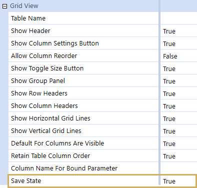
Save State
This property enables user preferences for column Order, Visibility, Filtering, Sorting, and Width. If this setting is True, then the column activity can be changed and saved through the Grid View Column Format section. If this setting is False, the Vary Save State By property does not apply.
Vary Save State By
Apply Vary Save State By to Workflow Profile settings and Scenario. The current Save State elements will have the control state tied to the current Workflow Profile and Workflow Scenario settings. If you select Use Default, Vary By Save State does not apply.
When Vary Save State By is enabled, the related Component will have the additional reset option of Reset All States, which can be used to clear the user's Save States across all the Vary Save State By parameters.
Grid View Column Format
Click the  to display the Column Format window for the selected column.
ColumnName
The name of the column from the table where the selected formatting is to be applied. The specified name must match the column name from the table exactly.
Description
Column description to be displayed. By default, the column name from the table is displayed.
Column Display Type
You can choose from the following options:
-
Standard: This displays the default data in the column.
-
OneStreamClientImage: This replaces the data in the column with the associated image.
-
WorkflowStatusImage: This replaces the data in the column with the associated Workflow status indicator image.
IsVisible
This property overrides the default Columns Visible setting. The settings are True, False, or Use Default.
ParameterName
The assigned Parameter name to be used to store the Parameter value from the specified column.
Background Color
The background color to be displayed on the selected column. You can choose a color from drop-down menu.
IsGroupable
This determines whether the column can be used in the Group panel on the grid. The settings are True or False.
IsFilterable
This setting is located at the top of the column and turns the Filter button on and off. The settings are True or False.
ShowDistinctFilters
This setting turns the filter option on and off, which enables users to use checkboxes to select filtered Members. The settings are True or False.
ShowFieldFilters
This enables and disables advanced filtering on the specified column. The settings are True or False.
IsSortable
This enables and disables sorting on the specified column. The settings are True or False.
IsMultilineText
This setting allows columns to display data on multiple rows if the column is not wide enough to display the full value. The settings are True or False.
NOTE: The data will wrap on string spacing. If there are no blank spaces, the column data will not wrap. Additionally, keyed fields cannot be wrapped.
DataFormatString
Specify a number and date format for the data in the column. For example, mm/dd/yyyy will return the current Month/Day/Year using a slash. MM-dd-yyyy will return the Month-Day-Year using a dash. N0 will return a number without a decimal point, and #,###,0 will return a number without a decimal and a comma depicting the thousandth place. See General Properties for more examples of number formats.
Width
This property specifies the default column width to be displayed.
Drag and Drop
You can rearrange the columns, drag and drop the headers, and sort the columns. If Save State is True, changes to headers and columns are saved.
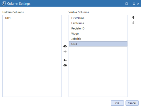
If Save State is False and you view the dashboard, you can’t drag and drop headers. Click the Column Settings button to open the Column Settings window.
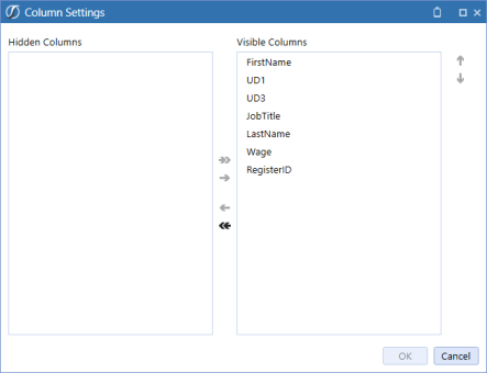
You can hide columns and change the order the columns are shown on the dashboard.
Reset State
When you view a dashboard, right-click Reset State 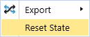 to go back to the default settings of the grid view component.
Sort Column
When you click on a column header, it will sort the column:
-
First click: Ascending order.
-
Second click: Descending order.
-
Third click: No sorting order.
If Save State is set to True, the changes to the sort order are saved.
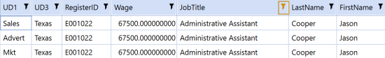
Filter
When a new filter is applied to the grid, the filter icon is orange to show that it has been changed.