Styles
The Styles page includes the following panes:
-
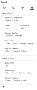
On the left pane, you can view settings and apply them to the navigation bar and page bar.
-
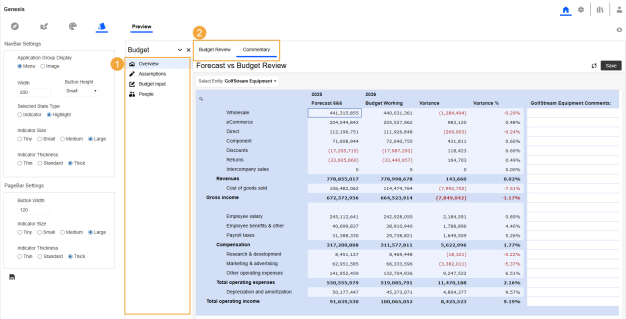
The Preview pane displays a preview of the end-user view with the saved settings applied.
-
Navigation bar
-
Page bar
In the upper right, you can set your preference to turn the preview on (click the Show Preview
 button) or off (click the Hide Preview
  button).
 -
-
In the left pane, select the style settings. See NavBar Settings and PageBar Settings.
-
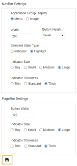
Click the Apply Selected Layout Settings to Application Foundation button to apply the style and view the updates in the Preview pane.
NavBar Settings
Application Group Display
-
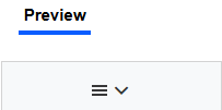
Menu: Select to view the description for the selected item in the Application Groups drop-down menu.
-
Image: Select to view a menu image for the selected item in the Application Groups drop-down menu. Use this option to reduce size in the navigation bar.
Width: Enter the number of pixels to set the width of the navigation bar.
Button Height: Select the height of the space for each item in the navigation bar.
TIP: To make space for long names or a larger font size, you can increase the navigation bar width or button height.
Selected State Type
-
Indicator: Select to include a vertical indicator bar next to the selected item in the navigation bar.
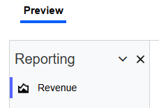
-
Highlight: Select to highlight the selected item in the navigation bar.
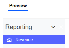
NOTE: The color listed in NavBarButtonIndicatorBackground on the Colors page is used for the vertical indicator bar or highlight. See Apply a Color Set.
Indicator Size: If you selected Indicator as the Selected State Type, choose a length for the vertical bar: Tiny, Small, Medium, or Large.
Indicator Thickness: If you selected Indicator as the Selected State Type, choose a thickness for the vertical bar: Thin, Standard, or Thick.
PageBar Settings
Button Width: Enter the number of pixels to set the width of the page bar tabs.
TIP: To make space for long names, you can increase the button width.
Indicator Size: Select a length for the horizontal bar under the Page name: Tiny, Small, Medium, or Large.
Indicator Thickness: Select a thickness for the horizontal bar under the Page name: Thin, Standard, or Thick.


