Once you have specified the targets to be used in your SensibleAI Forecast project, use the Data Set page to:
-
Designate hierarchies based on your target data set.
-
Review the project-level and advanced views of the merged data. Both views provide statistics on the merged data set and provide insight into how well your target data set is suited for your project.
Run Data Dataset
Use settings in the Run Data Dataset dialog box to designate hierarchies based on target data, determine how your data is grouped for your project, as well as configure the thresholds required to run feature engineering, grouping, and each model. Click Run on the Dataset page. The Run Data Dataset dialog box displays, which is broken up into the following steps:
Step 1: Hierarchies
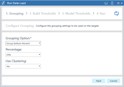
In the Hierarchies Section, select hierarchies to be included in the project. Hierarchies cannot exceed environment restrictions for target limit. Include fields for all of the following:
Hierarchy Name: A unique name for the created hierarchy
Intersections: Which dimensions the hierarchy should include.
Target Count: Targets generated for the given hierarchy.
Reconciliation Strategy: The strategy to use so forecasts “tie out” up and down the hierarchies.
-
Minimum Trace: Minimum Trace Reconciliation is a statistical method used to adjust forecasts across hierarchical levels to ensure consistency while minimizing total forecast error variance. It leverages the forecast error covariance structure to optimally combine base forecasts from all levels, often resulting in more accurate and coherent forecasts compared to simpler approaches.
-
Bottom Up: Bottom-Up Reconciliation is a simple method where forecasts are first generated at the most detailed (lowest) level of the hierarchy and then aggregated up to higher levels. This ensures perfect coherence across the hierarchy but may overlook useful information available at aggregated levels, potentially reducing overall forecast accuracy.
-
None: If no reconciliation strategy is selected, forecasts are produced independently at each level of the hierarchy without any adjustment for coherence. This can lead to inconsistencies where aggregate forecasts do not match the sum of their components, but may still be acceptable if coherence is not critical for the use case.
Step 2: Grouping
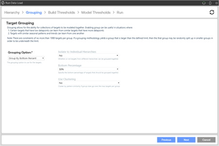
In the Grouping Option field, select how you want to group targets for the model:
No Groups: Targets are not grouped for this model.
Group Bottom Percent: Groups together all targets that fall below a given percent of total significance. Use the Significance by Target charts and the Grouping Percentage (Bottom X Percent) drop-down option to understand how many targets fall below a given percent of total significance. In a situation where 50 targets out of 1,000 make up 90% of the total significance, it can be beneficial to group the lowest 10% to spend the majority of the model build resource on training the most significant targets.
If selecting Group Bottom Percent as the grouping option, you must also set the following options that display in the dialog box based on these selections:
-
Bottom Percentage: Select the appropriate bottom percentage from the list.
-
Use Clustering: Set to Yes take the targets grouped together that fall below a given percent of total significance and group further based on data similarities recognized by the XperiFlow engine.
-
Isolate to Individual Hierarchies: Whether or not targets from different hierarchies can be grouped together.
-
Group By Target Dimensions: If selecting Group By Target Dimensions as the grouping option, you must also set the following options that display in the dialog box based on these selections:
-
Target Dimensions: Shows dimensions selected when you select targets and define the data set. Select the dimensions you want to be grouped
TIP: Two or more target dimensions must exist to select the dimensions to be grouped.
-
Isolate to Individual Hierarchies: Whether or not targets from different hierarchies can be grouped together.
-
Group by Clustering: This selection groups targets together based on data similarities recognized by the XperiFlow engine. The primary reason for grouping by clustering is to improve predictive accuracy.
Clustering involves grouping targets. A clustering algorithm classifies each target into a specific group, since targets in the same group typically have similar properties or features. Targets in different groups typically have highly dissimilar properties or features. Clustering provides valuable insights into data by showing what groups the targets fall into when clustering is applied.
Providing inverted views, both charts on this page illustrate the percent of total significance of targets along with the percentage within which they would be included for grouping.
Step 3: Build Thresholds
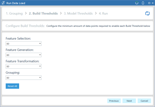
The Build Thresholds section of the dialog allows the user to configure how many data points are required to enable the following:
-
Feature Selection
-
Feature Generation
-
Feature Transformation
-
Grouping
The Reset All button will reset any changes made into these configurations to the defaults set in the Global Settings Dialog.
Step 4: Model Thresholds
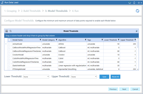
The Model Thresholds section of the dialog allows the user to configure how many data points are required to enable each model:
-
Lower Threshold Combo Box: The minimum required data points for the model to be used.
-
Upper Threshold Combo Box: The maximum required data points for the model to be used.
-
Save Button: Updates the selected models to the new thresholds configured in the Lower and Upper Threshold combo boxes.
-
Reset All Button: Resets any changes made to these configurations to the defaults set in the Global Settings Dialog.
Step 5: Run
Click Run to start the data load job and monitor job progress. Click Close to close the Job Progress dialog box at any time while the job is running or after it has completed.
The XperiFlow engine analyzes the targetsand creates target groupings if grouping is selected. It also gathers descriptive statistics on the results.
When the job successfully completes, click Refresh Current Page  . The Dataset page updates and displays an overview, aggregate, and advanced pages that show statistics on the merged data set.
The Run button no longer displays once the data set job successfully completes. The Data Set Overview pane displays key statistics for your project, including the number of features and targets, the frequency of the data, and the number of unique dates.
Build Statistics at the bottom of the Dataset page update to show the number of total targets, and indicate whether Grouping, Events, and Locations are enabled. Also, the Explore Targets and Features, Data Source Update (for initial rebuild) and Consumption Groups pages are now enabled, and shows target and feature (if used in the data set) statistics for each unique data element in the data set.
Review Dataset Overview Statistics
The following graphic shows the Dataset page overview statistics:
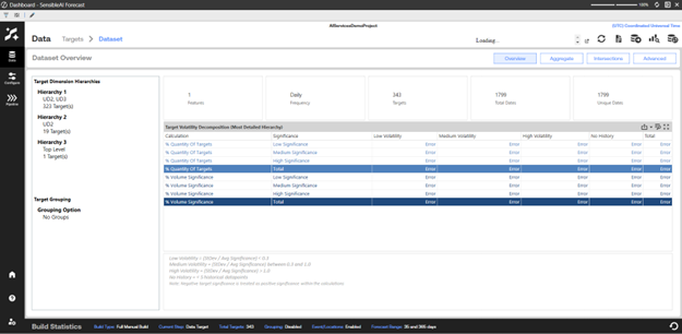
The top of the Dataset Overview statistics view includes:
Features: The number of unique features produced by the data set job.
Frequency: Shows the time frequency of the overall data set. The time frequency is set based on the target that has the most granular level data. Frequency can be one of the following values:
-
Daily
-
Weekly
-
Monthly
-
Yearly
NOTE: The frequency of an entire data set remains constant across all targets. If a data set frequency is not constant across all targets, it is recommended that the data set is split into multiple projects (one for each frequency). If kept in the same project, the most granular frequency target determines the overall data set frequency. The targets that are a less granular frequency have non-matching dates treated as missing values and are cleaned to get a complete series of the same frequency as the most granular data.
Targets: The number of unique targets in the merged data set.
Unique Dates: The number of unique dates in the merged data set.
Total Dates: The total number of unique dates in the merged data set. This may be greater than the unique dates because the data set may be missing dates based on frequency. The Total Dates statistic includes these missing dates.
Project statistics at the bottom of the Overview include:
Target Volatility Decomposition Chart: Shows the number of different volatile targets (low, medium, high). This is based on the standard deviation of the target versus the mean. It also shows how many of those targets are determined to be low, medium, or high significance. The most detailed hierarchy is used to generate these statistics.
Target Grouping: The grouping method chosen for this model build.
Target Dimension Hierarchies: The dimensions and target counts in each hierarchy.
Review Dataset Aggregate Statistics
The Dataset Aggregate statistics includes Aggregate Target Time Series that can be sliced down to different granularities by dimension.
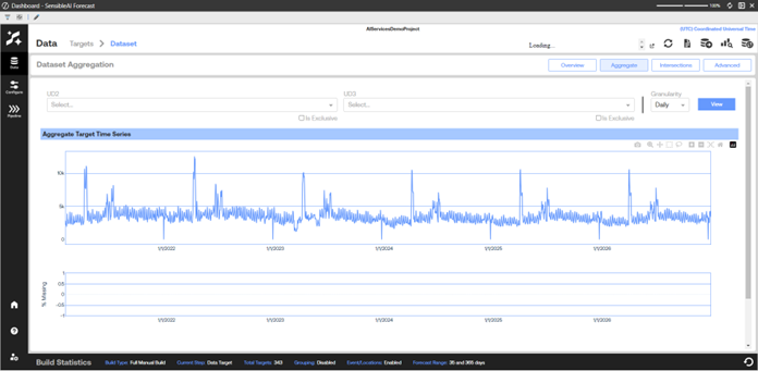
Aggregate Target Time Series: The aggregation of all targets on each given date in the data set. This helps to identify data set seasonality as a whole, on given time periods, or large trends over time.
TIP: Use the date range sliders at the bottom of the page to change the time range on the Aggregate Target Time Series chart.
% Missing: The percent of targets that are missing data on each given date.
Review Intersection Data Set Statistics
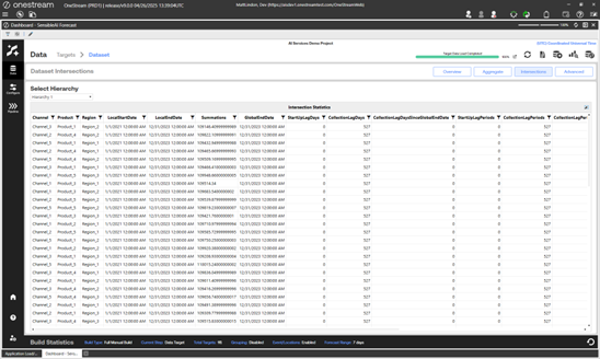
The Intersection view of the data set statistics shows the generated artifact associated with each hierarchy that was created. Every hierarchy will have a unique artifact that includes every target generated on that dimension combination.
Review Advanced Data Set Statistics
The Advanced view of the data set statistics shows the statistics in the Project view along with additional charts. Click Advanced in the Data Set Project view to display the advanced statistics.
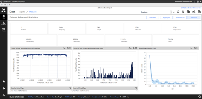
The Dataset Aggregate statistics include:
Forecastability: A percentage grade that is specific to SensibleAI Forecast that indicates how forecastable the target data set is. This metric is calculated as a percent of total targets (0- 100%) within the data set that are synonymous with random noise (which means no reasonable patterns can be detected). A score closer to 100% is desired.
Seasonality: A calculation of the percent of total targets (0-100%) in the target data set that have identifiable seasonality. A score closer to 100% is desired.
Stationarity: Indicates the percent of total targets (0-100%) in the target data set that are stationary, which means they do not experience a noticeable value level-shift. For example, a target whose mean value changes by 20% year-over-year would not be considered stationary. For certain time series models, it is easier to predict for stationary targets.
Trend: A calculation of the percent of total targets (0-100%) in the target data set that have an identifiable trend.
Percent of Total Targets by Historical Actual Date: This chart visualizes the percent of total targets with either non-zero and non-missing values, zero (Zeros) values, or missing (Nans) values (depending on the drop-down selection) over the data set’s historical time frame. This provides the essential view on data sparsity over time.
Percent of Total Targets by Historical Actual Count: This distribution chart visualizes the percent of total targets with a given number of non-zero, non-missing, or non-zero or non-missing data points (x-axis), providing another view of data sparsity. Ideally, there should be as many targets as possible approaching the maximum number of available data points.
Global Target Absolute PACF (Partial Autocorrelation Function): A PACF chart demonstrates correlation (-1 to 1) of values based on the time increment between them. For example, a daily-level data set with a PACF score of 0.5 at an x-axis point of 7 signals that, on average, today’s value has a correlation coefficient of 0.5 with the value of 7 days prior. This chart visualizes the mean, 90th percentile, and 10th percentile PACF score.
Use the information shown in the updated Dataset page to verify that target and grouping results are as expected. If you are satisfied with the grouping results, continue in the Model Build phase to the Configure section.


