The Arena page is an exploratory page that does not require any specific action. It provides valuable insight by analyzing evaluation metrics and features across models and targets gathered during the model arena.
The Arena page consists of different views (Forecast, Feature Impact, Beeswarm, and Tug of War). To select a view, click on its button at the top of the page.
For all views available for the Arena page, use the left-most panel to filter the models available in the Leaderboard pane. Then select a specific Model to view its performance.
Arena Accuracy View
The Accuracy view allows the user to view source actuals overlaid with the selected model’s predictions. Error metrics are displayed in the correlated subplot below. Select a datapoint on the plot to view explanations for a given prediction.
This helps to answer questions such as:
-
Which type of model has the best accuracy for a given target?
-
By how much did the model win?
It also helps you understand how closely the forecasted values overlay the actuals in the line chart, which can provide answers to questions such as:
-
Are there spikes that aren’t being caught by the forecasts?
-
If so, could adding any events help catch these spikes?
NOTE: Error metric scores do not dynamically adjust based on the time period specified by the range slider at the bottom of the page.DELETE THIS??
The table on this page displays:
-
The model algorithms run for a given target (such as XGBoost, CatBoost, or Shift).
-
The type of model algorithm (ML, Statistical, or Baseline).
-
The evaluation metric (such as Mean Squared Error, Mean Absolute Error, and Mean Absolute Percentage Error) and the associated score.
-
The train time (How long did it take to train the given model during Pipeline?).
With all the configurations and the newly found important features, the engine runs multiple models per configuration to find the best. This process involves hyperparameter tuning each model on multiple splits of the data and then saving the accuracy metrics of each model.
To analyze the training results, click a target in the Targets pane to see the accuracy metrics of each it its deployed models if implemented over the course of its past data. Each model listed shows its name and category, along with the type of evaluation metric used and the evaluation metric score. Select a model name in the models list to view a line chart that shows how close the forecasted values are to the actuals.
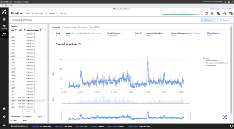
The line chart corresponds to the highlighted model in the table. It visualizes both the predictions made for the historical actual test period and the historical actuals. The time frame in this chart is only a subset of the total time frame for the historical data, as this time frame is for a specific portion of a split.
At a high level, this page provides the view of how the best version of each model (such as XGBoost, CatBoost, ExponentialSmoothing, Shift, and Mean) has performed against unseen historical data for each target and more specifically, on the test set of the historical data.
The optimal error metric score can be the lowest score, the highest score, or the closest to zero. It is dependent on the type of metric. See Appendix 3: Error Metrics for more information about the error metrics SensibleAI Forecast uses.
The line chart corresponds to the highlighted model in the table. It visualizes both the predictions made for the historical actual test period and the historical actuals. The time frame in this chart is only a subset of the total time frame for the historical data, as this time frame is for a specific portion of a split.
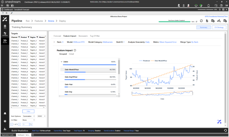
Arena Feature Impact View
The Feature Impact view shows the hierarchical (Grouped) or individual (Detail) feature impact percentages aggregated across all the model’s prediction values. The user can click on a feature name from the table to view its actual values compared with the predictions and actuals in the visual on the right. The prediction and actual values are bound by the primary y-axis on the left hand side of the graph, while the feature values are bound by the secondary y-axis on the right. The feature impact score shows how much influence the feature had for a given model.
NOTE: Feature impact data is dependent on the type of model. Not all models have feature impact data.
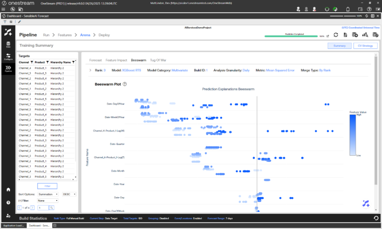
Arena Beeswarm View
The Beeswarm view visualizes the impact of features on model predictions by displaying SHAP values as individual dots, where each dot represents a feature’s SHAP value for a specific instance. Features are ordered by importance, with the most influential ones at the top. The color of each dot indicates the actual feature value. The horizontal spread of dots reflects the distribution of SHAP values for each feature, showing how much they contribute to model predictions. Plot is based on source granularity and changing the Analysis Granularity will not change the plot.
Arena Tug of War View
NOTE: Only models that use features have feature explanation data.
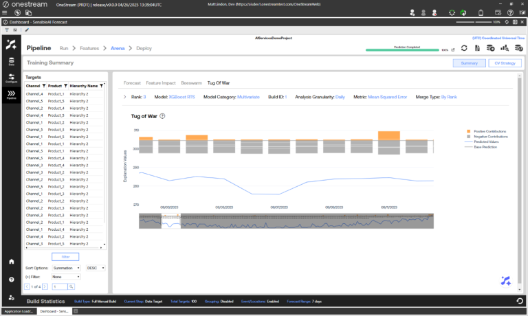
The Tug of War view visualizes the four most significant positive and negative prediction explanations for all dates at the selected Analysis Granularity of the selected model. Compare with base predictions and actual prediction values for all dates. Users can toggle any component of the visual on or off by selecting it from the legend on the right. Users can also narrow in on specific dates by interacting with the range slider.
Arena CV Strategy View
The CV Strategy view shows how the splits were used in each model stage and the portion of the splits. Select the Model stage using the Cross Validation Usage drop-down. Split usage can then display in the Cross Validation Splits Chart.
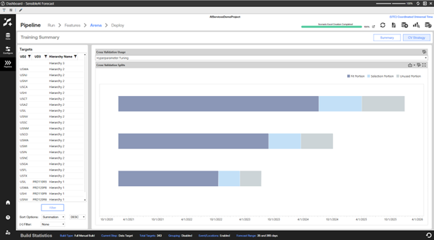
The number of splits and size of each portion of the splits can be configured when you Set Modeling Options. A description of how each portion of the split is used follows.
Train Set: The split of historical data on which the models initially train and learn patterns, seasonality, and trends.
Validation Set: The split of historical data on which the optimal hyperparameter set is selected for each model, if applicable. A model makes predictions on the validation set time period for each hyperparameter iteration. The hyperparameter set with the best error metric when comparing predictions to the actuals in the validation set time period is selected. This split does not occur when the historical data set does not have enough data points.
Test Set: The split of historical data used to select the best model algorithm compared to the others. For example, an XGBoost model gets ranked higher than a baseline model based on evaluation metric score. This split does not occur when the historical data set does not have enough data points.
Holdout Set: The split of historical data used to simulate live performance for the model algorithms. This is the truest test of model accuracy. This set can also serve as a check for overfit models. This split does not occur when the historical data set does not have enough data points.


